22
Fails, MedHomePXL 7/14Effort ~1hWho: ThemeTestHOM-03
One dominant call to action on the first screen
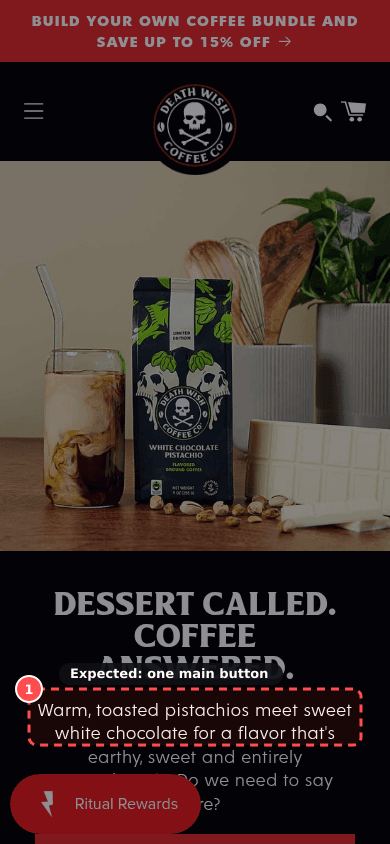
deathwishcoffee.com
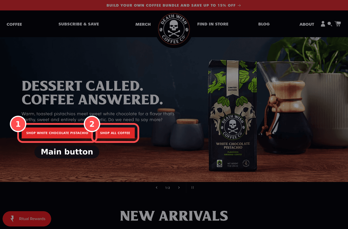
01What we found
No button-styled call to action was visible on the first screen.
02Why it costs sales
When several buttons compete with equal weight, the eye has no entry point; one visually dominant CTA works as Fogg's prompt.
The research: visual hierarchy, choice overloadMain cause: distraction / clarityFixes: prompt
03The fix. Who: Theme
- 1Keep one solid, high-contrast button in the hero ('Shop linen'); turn secondary actions into outline buttons or text links.
04What should change
Med impact on returning-visitor CVR
If we make one primary CTA visually dominant and demote the others to text links, then first-click rate on the home page will rise, because shoppers see the obvious next step.
mobile 390, deathwishcoffee.comnngroup.comconversion.combehaviormodel.org