Skip to content
Sample report: a real, unedited scan

Conversion audit. Shopify store. Scanned 3 Oct, 16:36 PKT

deathwishcoffee.com

Shoppers get through most of the store, then stall on page speed and the product page.

Issues to act on
27
High severity
6
Checks observed
99%
Pages walked
6

Health score

76

/ 100

Solid

01. Summary

Where the money leaks, closest to the sale first.

What's working. Leave it alone.

  • Reviews present and linked from the titleReviews are present and the star badge can reach them.
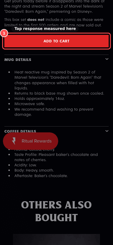
  • Add to cart visible on the first mobile screenThe main Add to cart starts at 1282px, below the 844px first screen, but a sticky Add to cart bar is present so it stays reachable.
  • Add to cart works and gives clear feedbackAdd to cart worked (cart count increased) in 793ms.
  • Variant selector is clear and honestVariant changes update the price, and sold-out options are marked when they exist.

02. Each step

The path to buy, one step at a time.

  1. 01. Home

    3.5/ 5

    Partial5 issues
  2. 02. Collection

    5.0/ 5

    Works1 issue
  3. 03. Product

    3.0/ 5

    Partial12 issues
  4. 04. Cart

    5.0/ 5

    Works0 issues
  5. 05. Checkout

    4.5/ 5

    Works1 issue

03. Scores by area

Areas closer to the sale count more.

AreaWeightScore
Product page×53.0
Checkout entry×44.5
Speed×33.0
Cart×25.0
Home / first impression×23.5
Collection×25.0
Trust×23.5

Health = 5*Product page + 4*Checkout entry + 2*Cart + 2*Home / first impression + 2*Collection + 2*Trust + 3*Speed, each area 1 to 5, scaled to 100. Every area had at least one observed check. Scored from public pages only. Directional, not a forecast.

04. Findings (27)

Every leak, with evidence, reason and fix.

Product

12 findings

01

Fails, HighProductPXL 11/14Effort ~1hWho: ThemeJust do itPDP-02

Name, price and proof above the fold
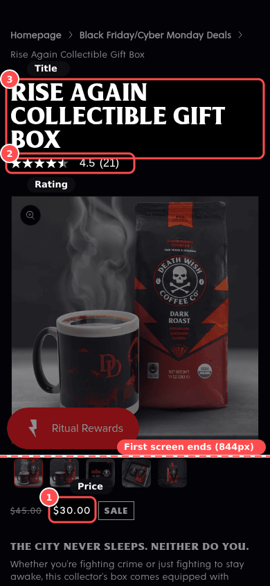
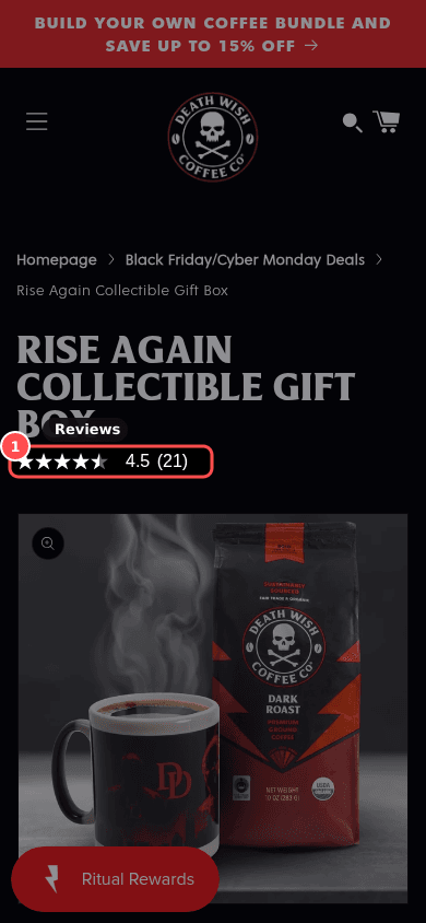
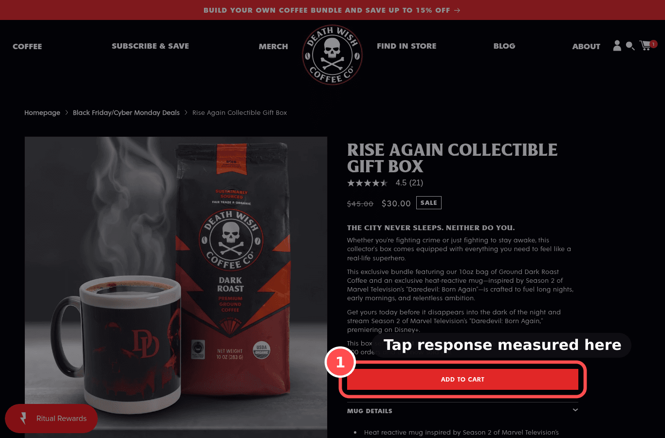
Phone screenshot on deathwishcoffee.com/products/rise-again-collectible-gift-box, marked to show: Name, price and proof above the fold
Mobile, 390 × 844
deathwishcoffee.com/products/rise-again-collectible-gift-box
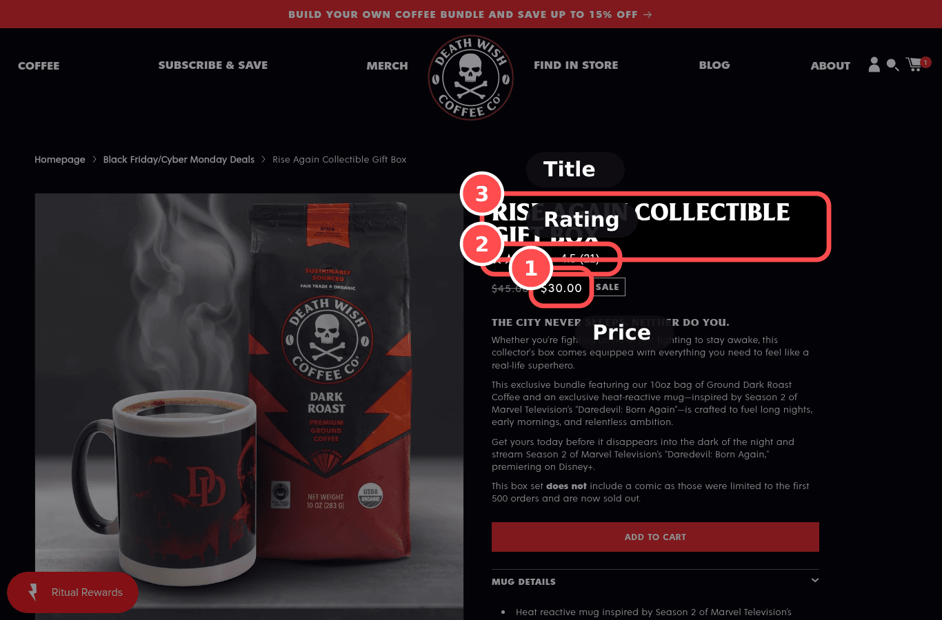
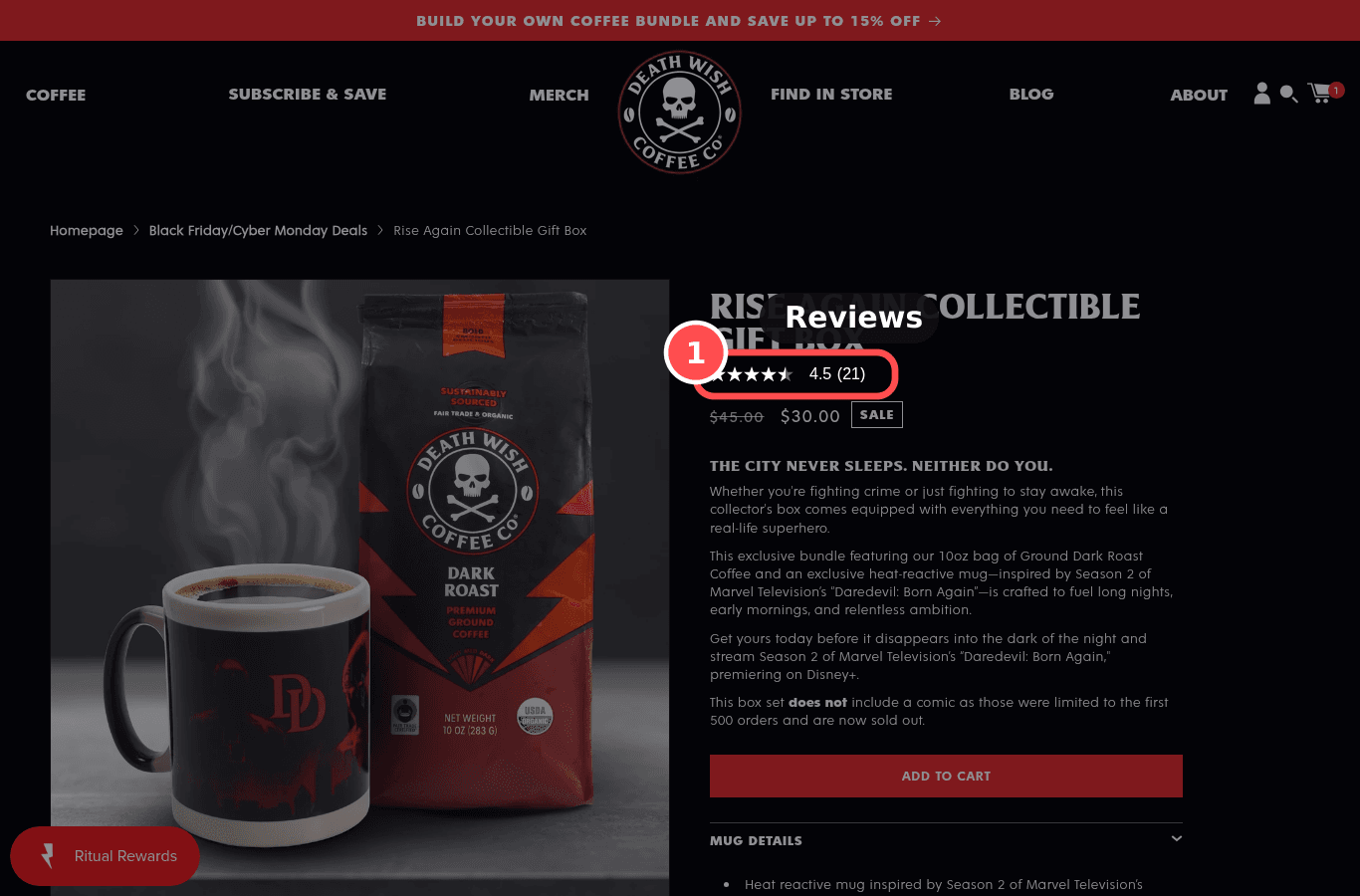
Desktop screenshot on deathwishcoffee.com/products/rise-again-collectible-gift-box, marked to show: Name, price and proof above the fold
Desktop, 1366 × 900

01What we found

Price ($30.00) starts 909px down, below the 844px first screen. Star rating starts 414px down, inside the first screen.

02Why it costs sales

Shoppers scan the top-left first; title, price and rating together answer 'what, how much, is it good' in one look.

The research: F-pattern, social proofMain cause: value proposition / clarityFixes: motivation

03The fix. Who: Theme

  1. 1Show the product name, price and star rating together at the top of the page on mobile, next to the buy button.

04What should change

High impact on add-to-cart

If title, price and rating sit together above the fold, then add-to-cart rate will rise, because key decision info is seen first.

mobile 390, deathwishcoffee.com/products/rise-again-collectible-gift-boxnngroup.comcxl.com
02

Fails, HighProductPXL 11/14Effort ~2hWho: Theme + Content/OpsJust do itPDP-07

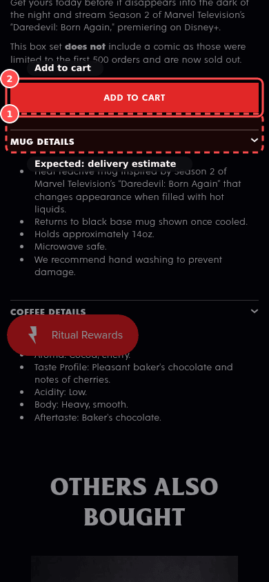
Delivery cost and date shown near Add to cart

Phone screenshot on deathwishcoffee.com/products/rise-again-collectible-gift-box, marked to show: Delivery cost and date shown near Add to cart
Mobile, 390 × 844
deathwishcoffee.com/products/rise-again-collectible-gift-box
Desktop screenshot on deathwishcoffee.com/products/rise-again-collectible-gift-box, marked to show: Delivery cost and date shown near Add to cart
Desktop, 1366 × 900

01What we found

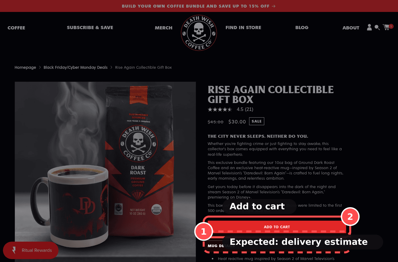
Neither a shipping cost or threshold nor a delivery estimate was found near Add to cart.

02Why it costs sales

A cost that appears only at checkout feels like a loss; a concrete date is easier to judge than 'ships in 3 to 5 days'.

The research: loss aversion, surprise costMain cause: anxietyFixes: motivation

03The fix. Who: Theme + Content/Ops

  1. 1Add a Text block under Add to cart: 'Free delivery over $75 · otherwise $6.95 · arrives in 3 to 5 business days'. Repeat it in the cart drawer. Later, show a date ('Arrives by Thu 9 Oct').

04What should change

High impact on add-to-cart

43% of benchmarked sites don't show shipping cost on the PDP while 64% of users look for it there (Baymard UX statistics); 40% of US abandoners cite extra costs (Baymard abandonment survey).

benchmark, not this store's forecast

If we show delivery cost, free-shipping threshold and arrival window under Add to cart, then checkout completion will rise, because shoppers can predict the total and no loss appears at the last step.

mobile 390, deathwishcoffee.com/products/rise-again-collectible-gift-boxbaymard.comeconometricsociety.orgnngroup.com

04

Warning, MedProductPXL 11/14Effort ~2hWho: Theme/AppTestPDP-03

Add to cart stands out, and the buy box is clean

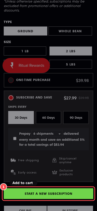
Phone screenshot on deathwishcoffee.com/products/power-surge-coffee, marked to show: Add to cart is visually dominant; buy box is uncluttered
Mobile, 390 × 844
deathwishcoffee.com/products/power-surge-coffee
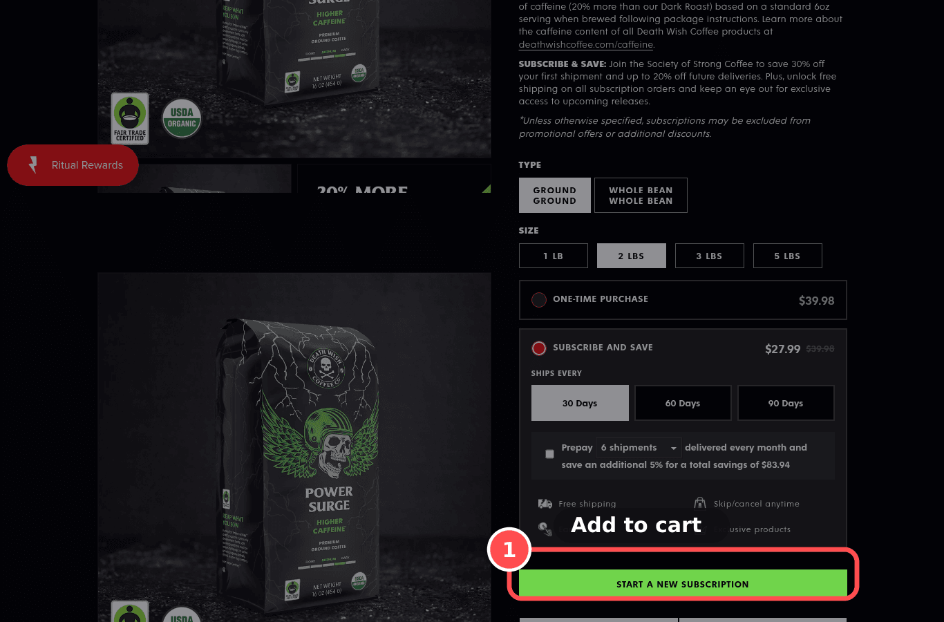
Desktop screenshot on deathwishcoffee.com/products/power-surge-coffee, marked to show: Add to cart is visually dominant; buy box is uncluttered
Desktop, 1366 × 900

01What we found

Buy box: 12 blocks between price and Add to cart. Dominant button: yes.

02Why it costs sales

Badges, app widgets and secondary buttons in the buy box compete with the one action that matters.

The research: visual hierarchy, choice overloadMain cause: distraction / clarityFixes: prompt

03The fix. Who: Theme/App

  1. 1Give Add to cart a full-width solid style in the brand accent; move badges, upsells and extra app widgets below the button.

04What should change

Med impact on add-to-cart

If we make ATC the largest, highest-contrast element and move non-essential widgets below it, then add-to-cart rate will rise, because the primary action stands out.

mobile 390, deathwishcoffee.com/products/power-surge-coffeenngroup.comconversion.combaymard.com

05

Fails, MedProductPXL 11/14Effort ~30mWho: Content/OpsJust do itPDP-08

Returns policy summarised near Add to cart

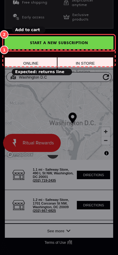
Phone screenshot on deathwishcoffee.com/products/power-surge-coffee, marked to show: Returns policy summarised near Add to cart
Mobile, 390 × 844
deathwishcoffee.com/products/power-surge-coffee
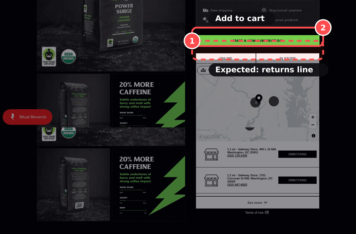
Desktop screenshot on deathwishcoffee.com/products/power-surge-coffee, marked to show: Returns policy summarised near Add to cart
Desktop, 1366 × 900

01What we found

No returns line or link was found within 600px of Add to cart.

02Why it costs sales

A short, plain returns line at the buy box removes the 'what if it doesn't fit' worry.

The research: risk reversal, loss aversionMain cause: anxietyFixes: motivation

03The fix. Who: Content/Ops

  1. 1Add a line under the delivery info: '30-day free returns', linking to the refund policy.

04What should change

Med impact on add-to-cart

44% of benchmarked sites don't link the return policy from the PDP (Baymard PDP 2026).

benchmark, not this store's forecast

If we add a one-line returns summary with a link next to ATC, then add-to-cart rate will rise, because purchase risk feels reversible.

mobile 390, deathwishcoffee.com/products/power-surge-coffeebaymard.comnngroup.com

06

Fails, MedProductPXL 11/14Effort ~30mWho: ThemeTestPDP-19

Express checkout buttons on the PDP

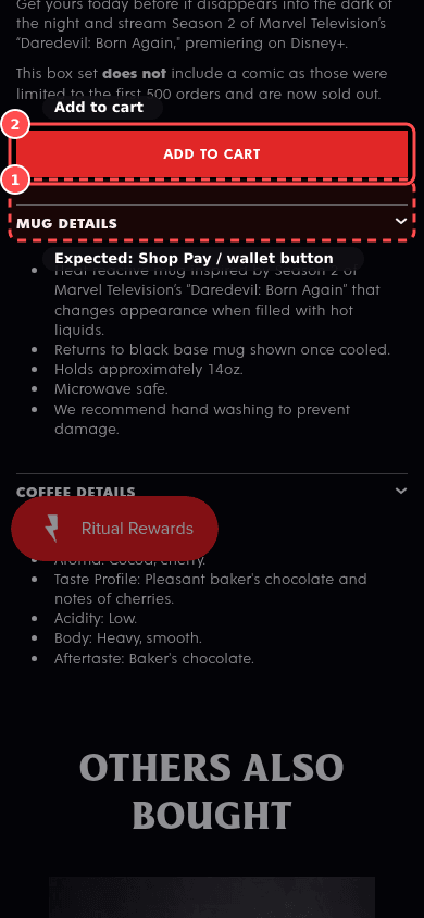
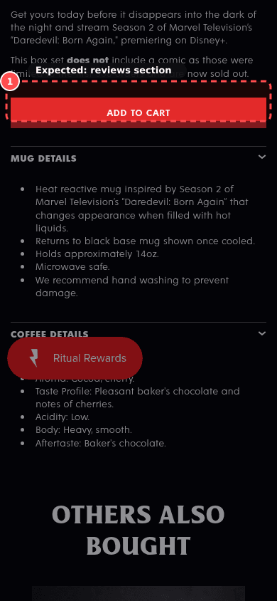
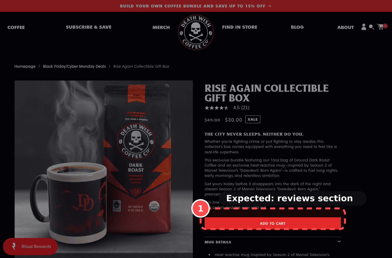
Phone screenshot on deathwishcoffee.com/products/rise-again-collectible-gift-box, marked to show: Express checkout buttons on the PDP
Mobile, 390 × 844
deathwishcoffee.com/products/rise-again-collectible-gift-box
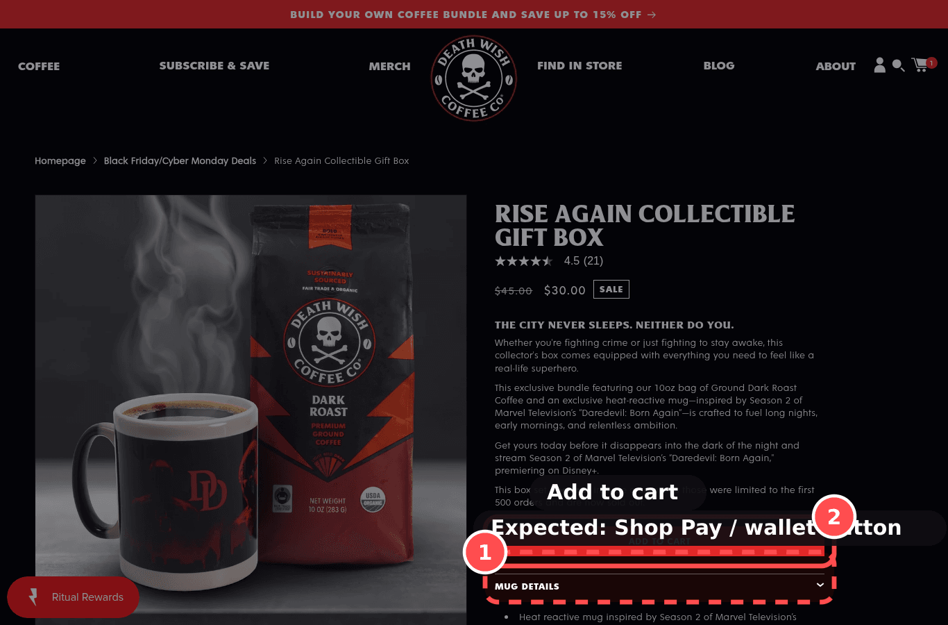
Desktop screenshot on deathwishcoffee.com/products/rise-again-collectible-gift-box, marked to show: Express checkout buttons on the PDP
Desktop, 1366 × 900

01What we found

No Shop Pay or dynamic checkout button was found next to Add to cart.

02Why it costs sales

Wallet buttons let returning wallet users skip forms; familiar payment brands also reassure on security.

The research: effort reductionMain cause: anxietyFixes: ability

03The fix. Who: Theme

  1. 1Turn on 'Show dynamic checkout buttons' in the product section so Shop Pay / Apple Pay / Google Pay appear under Add to cart.

04What should change

Med impact on add-to-cart

If we show dynamic checkout buttons on the PDP, then checkout completion will rise, because wallet users skip form entry.

mobile 390, deathwishcoffee.com/products/rise-again-collectible-gift-boxbaymard.combehaviormodel.org

09

Fails, MedProductPXL 9/14Effort ~2hWho: Content/OpsJust do itPDP-12

Enough product images, with thumbnails and zoom

Phone screenshot on deathwishcoffee.com/products/power-surge-coffee, marked to show: Enough product images, with thumbnails and zoom
Mobile, 390 × 844
deathwishcoffee.com/products/power-surge-coffee
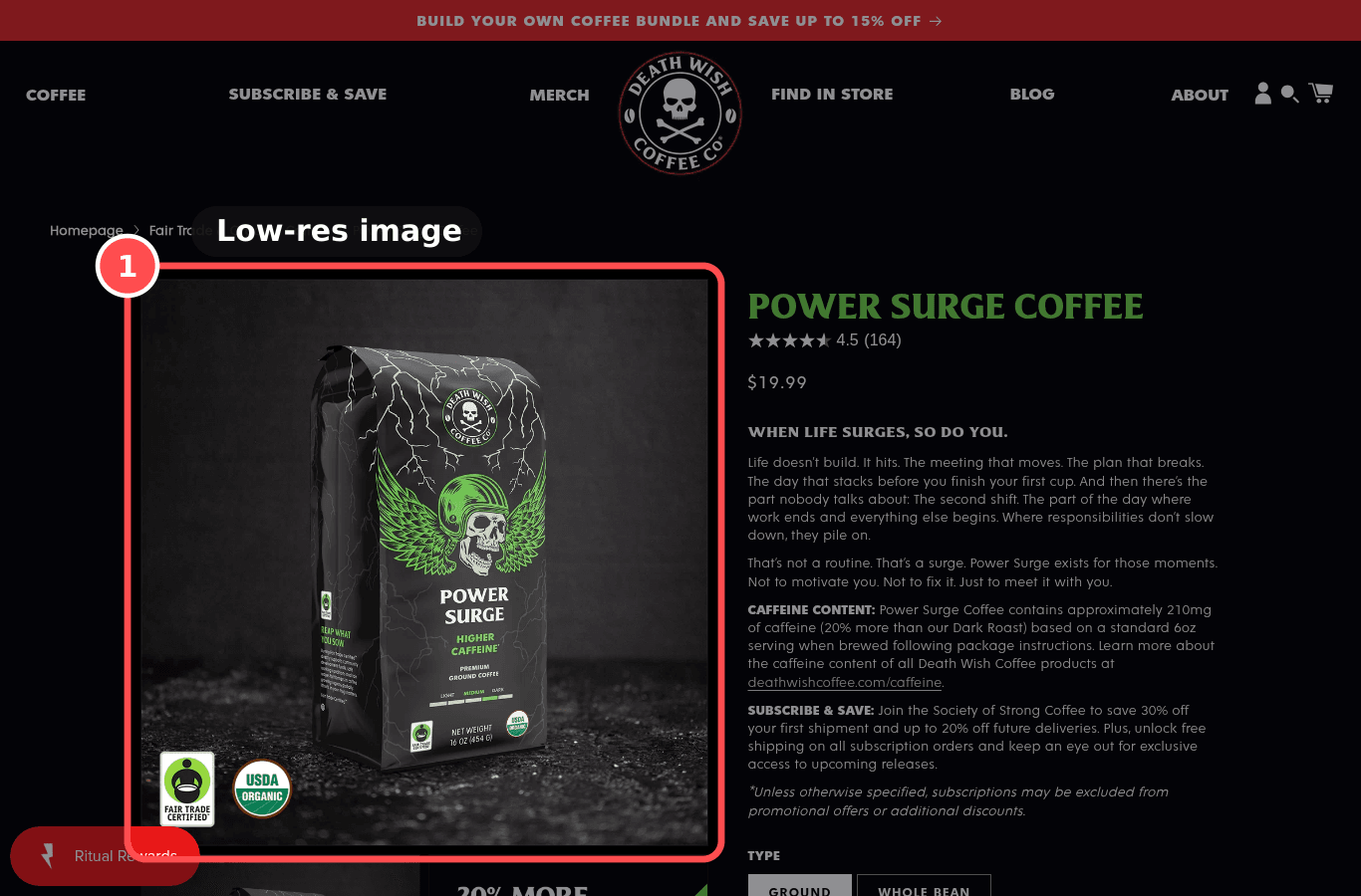
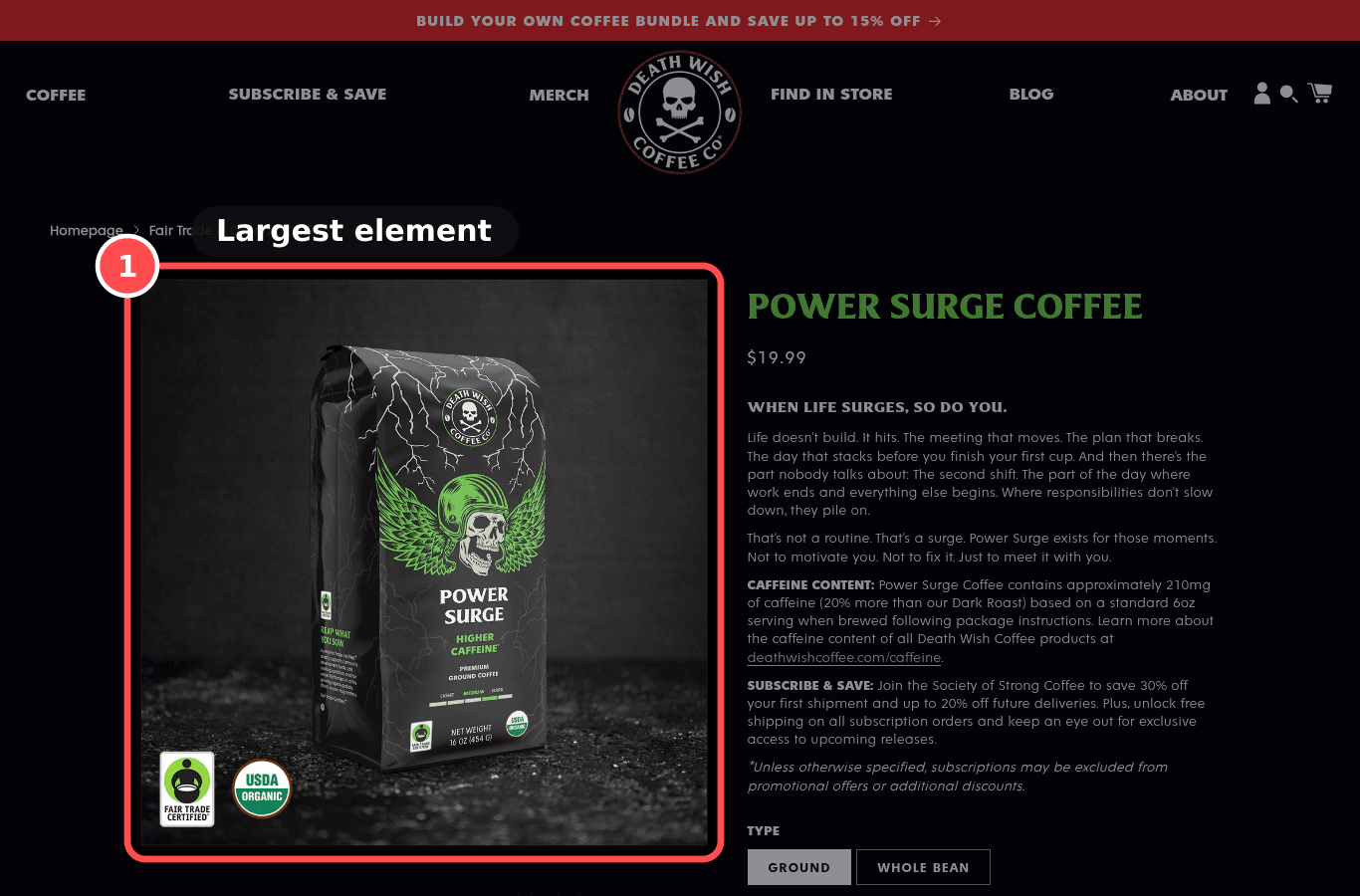
Desktop screenshot on deathwishcoffee.com/products/power-surge-coffee, marked to show: Enough product images, with thumbnails and zoom
Desktop, 1366 × 900

01What we found

6 product image(s). The main image is smaller than the space it fills.

02Why it costs sales

Online, images replace touch; too few images or hidden gallery navigation leave quality questions open.

The research: tangibilityMain cause: clarity / anxietyFixes: motivation

03The fix. Who: Content/Ops

  1. 1Add at least 3 to 5 photos (front, detail, in use/scale) and use your theme's zoom/swipe gallery.

04What should change

Med impact on add-to-cart

If each product has 3 to 5+ images with visible thumbnails and zoom, then add-to-cart rate will rise, because shoppers can inspect the product.

mobile 390, deathwishcoffee.com/products/power-surge-coffeebaymard.comcxl.com

10

Fails, MedProductPXL 9/14Effort ~1hWho: Content/OpsJust do itPDP-15

Size guide available near the size selector

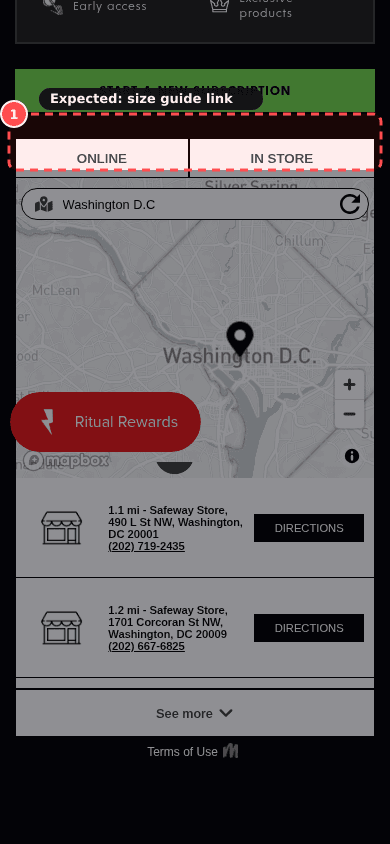
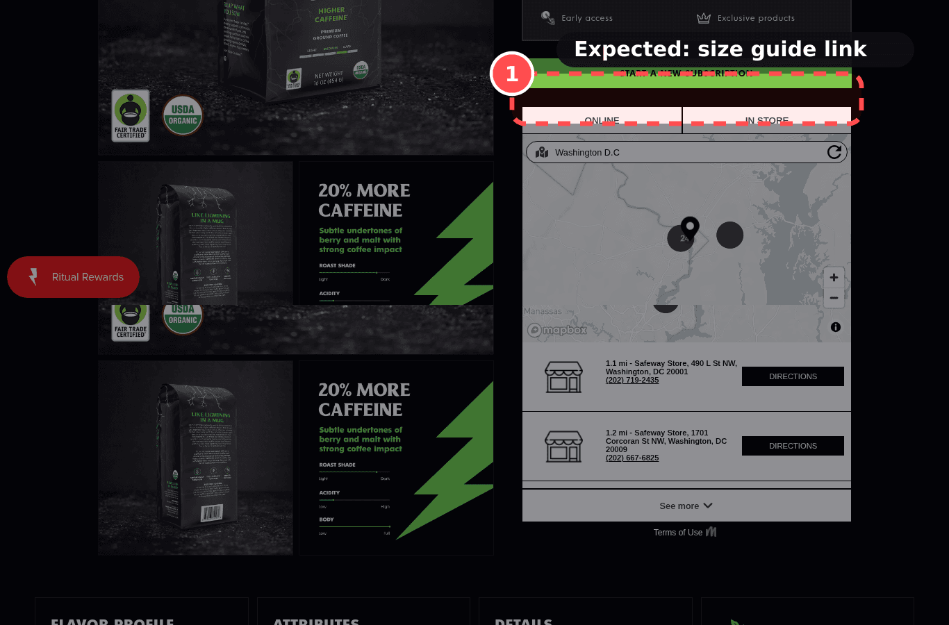
Phone screenshot on deathwishcoffee.com/products/power-surge-coffee, marked to show: Size guide available near the size selector
Mobile, 390 × 844
deathwishcoffee.com/products/power-surge-coffee
Desktop screenshot on deathwishcoffee.com/products/power-surge-coffee, marked to show: Size guide available near the size selector
Desktop, 1366 × 900

01What we found

The product has a size option and no size guide was linked from the page.

02Why it costs sales

Fit uncertainty makes apparel shoppers hesitate; a size guide at the selector answers it in context.

The research: uncertainty reductionMain cause: anxietyFixes: ability

03The fix. Who: Content/Ops

  1. 1Add a 'Size guide' link beside the size picker that opens a chart in a drawer, plus a one-line fit note ('Runs true to size').

04What should change

Med impact on add-to-cart

If we add a size-guide link next to the size options, then add-to-cart rate will rise, because shoppers can choose a size confidently.

mobile 390, deathwishcoffee.com/products/power-surge-coffeebaymard.com

14

Fails, MedProductPXL 8/14Effort ~2hWho: ThemeJust do itPDP-20

Tap targets are big enough and spaced on mobile

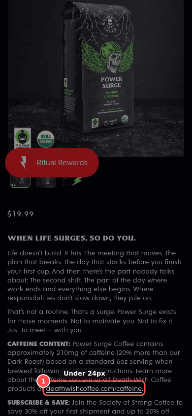
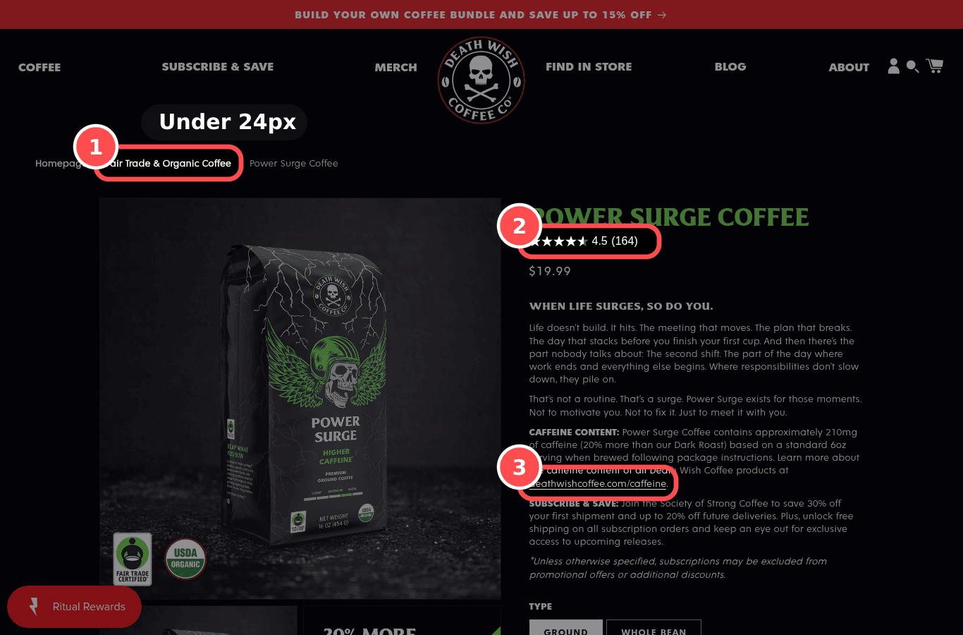
Phone screenshot on deathwishcoffee.com/products/power-surge-coffee, marked to show: Tap targets are big enough and spaced on mobile
Mobile, 390 × 844
deathwishcoffee.com/products/power-surge-coffee
Desktop screenshot on deathwishcoffee.com/products/power-surge-coffee, marked to show: Tap targets are big enough and spaced on mobile
Desktop, 1366 × 900

01What we found

3 tappable controls are under 24px, and Add to cart is under 44px tall.

02Why it costs sales

Small or crowded targets cause mis-taps on options and buttons where precision matters.

The research: Fitts's law, error preventionMain cause: clarityFixes: ability

03The fix. Who: Theme

  1. 1Make variant pills, quantity buttons and buy-box links at least 44px tall with 8px gaps.

04What should change

Med impact on add-to-cart

66% of benchmarked mobile sites place tappable elements too close; 32% make them too small (Baymard UX statistics).

benchmark, not this store's forecast

If we enlarge and space option and buy-box targets, then ATC errors will fall and add-to-cart will rise, because shoppers tap what they intend.

mobile 390, deathwishcoffee.com/products/power-surge-coffeew3.orgbaymard.comnngroup.com

16

Fails, LowProductPXL 8/14Effort ~2hWho: App + Content/OpsTestPDP-10

Reviews have depth: photos, filters, responses to negatives

Phone screenshot on deathwishcoffee.com/products/rise-again-collectible-gift-box, marked to show: Reviews have depth: photos, filters, responses to negatives
Mobile, 390 × 844
deathwishcoffee.com/products/rise-again-collectible-gift-box
Desktop screenshot on deathwishcoffee.com/products/rise-again-collectible-gift-box, marked to show: Reviews have depth: photos, filters, responses to negatives
Desktop, 1366 × 900

01What we found

Reviews are present without photos, merchant replies, or a way to browse critical reviews.

02Why it costs sales

Shoppers seek out negative and photo reviews to check fit and quality; answered complaints show the brand cares.

The research: social proof credibilityMain cause: anxietyFixes: motivation

03The fix. Who: App + Content/Ops

  1. 1Turn on photo reviews and rating filters in the review app; reply politely and specifically to every 1 to 3 star review.

04What should change

Low impact on add-to-cart

89% of benchmarked sites don't respond to negative reviews; 63% don't let users browse reviewer images (Baymard PDP 2026).

benchmark, not this store's forecast

If we enable photo reviews and a rating filter and reply to negative reviews, then add-to-cart rate will rise, because reviews look credible and answer fit doubts.

mobile 390, deathwishcoffee.com/products/rise-again-collectible-gift-boxbaymard.comspiegel.medill.northwestern.edu

17

Fails, LowProductPXL 8/14Effort ~30mWho: Content/OpsJust do itPDP-17

Unit price shown where relevant

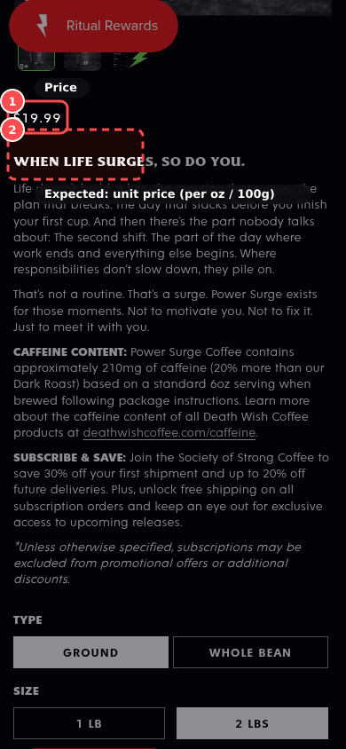
Phone screenshot on deathwishcoffee.com/products/power-surge-coffee, marked to show: Unit price shown where relevant
Mobile, 390 × 844
deathwishcoffee.com/products/power-surge-coffee
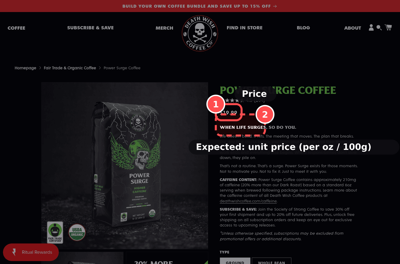
Desktop screenshot on deathwishcoffee.com/products/power-surge-coffee, marked to show: Unit price shown where relevant
Desktop, 1366 × 900

01What we found

This looks like a measurable product and no per-unit price was found.

02Why it costs sales

For packs and consumables, a per-unit price lets shoppers compare value quickly (and is legally required in some markets).

The research: comparison effortMain cause: clarityFixes: ability

03The fix. Who: Content/Ops

  1. 1Fill in the unit price fields on Shopify product variants and make sure the theme displays them.

04What should change

Low impact on add-to-cart

81% of benchmarked sites don't show a unit price (Baymard PDP 2026).

benchmark, not this store's forecast

If we show unit price on multi-pack/consumable products, then add-to-cart rate will rise, because value comparison is easier.

mobile 390, deathwishcoffee.com/products/power-surge-coffeebaymard.com

19

Fails, MedProductPXL 7/14Effort ~1 dayWho: Content/OpsTestPDP-13

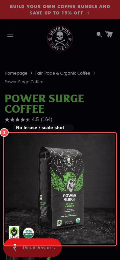
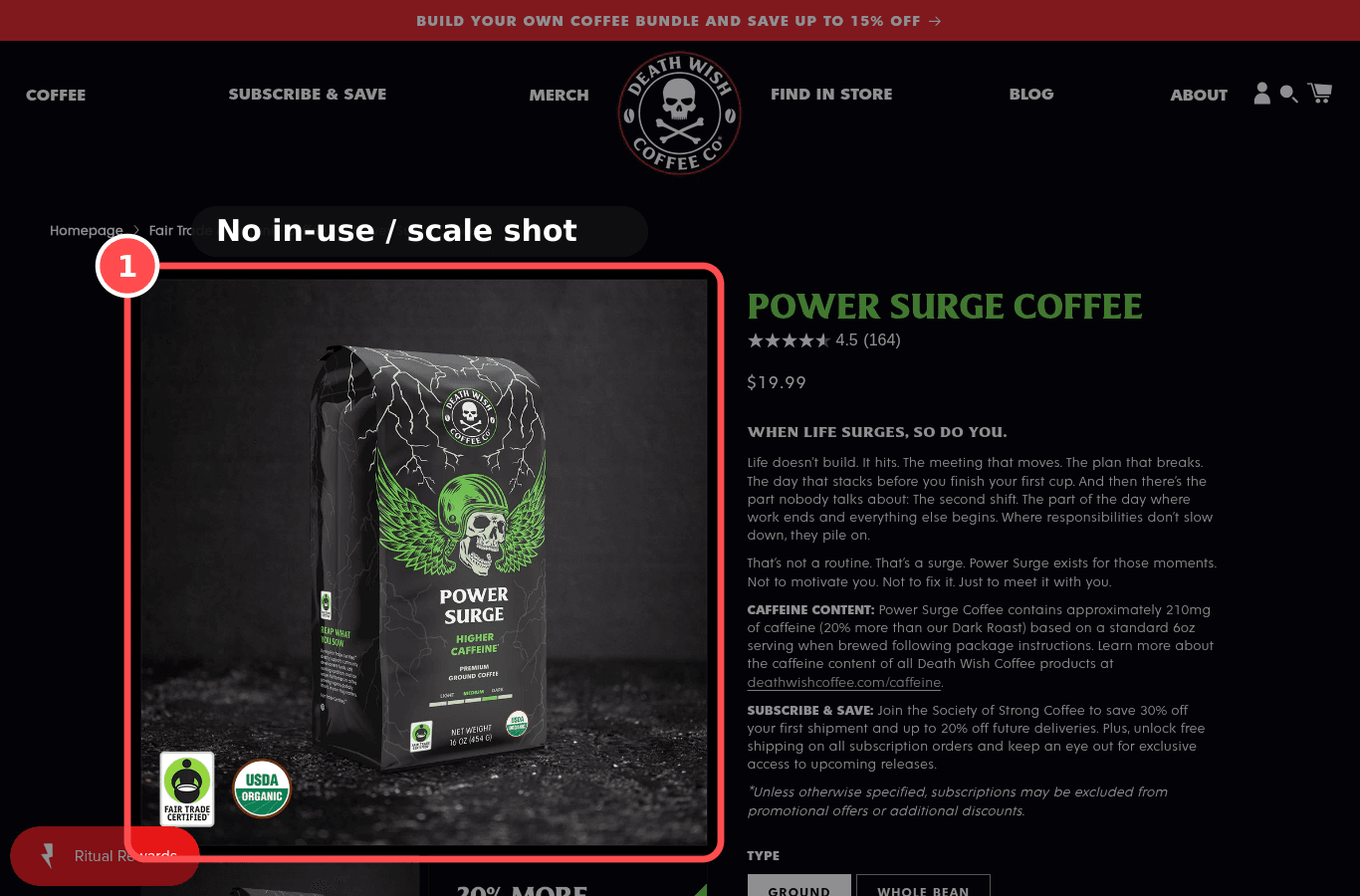
Photos show real size and the product in use

Phone screenshot on deathwishcoffee.com/products/power-surge-coffee, marked to show: In-scale and on-model images
Mobile, 390 × 844
deathwishcoffee.com/products/power-surge-coffee
Desktop screenshot on deathwishcoffee.com/products/power-surge-coffee, marked to show: In-scale and on-model images
Desktop, 1366 × 900

01What we found

Product images are present, and none of the visible image text describes a model or a scale reference.

02Why it costs sales

Without a person or object for scale, shoppers misjudge size and fit.

The research: tangibility, size uncertaintyMain cause: clarity / anxietyFixes: motivation

03The fix. Who: Content/Ops

  1. 1Add at least one photo of the product being worn or used, or next to a familiar object.

04What should change

Med impact on add-to-cart

37% of benchmarked sites have no in-scale image; 23% have no human model (Baymard PDP 2026).

benchmark, not this store's forecast

If we add an on-model or in-scale image to the gallery, then add-to-cart rate will rise, because shoppers can judge size.

mobile 390, deathwishcoffee.com/products/power-surge-coffeebaymard.com

20

Warning, MedProductPXL 7/14Effort ~1 dayWho: Content/OpsJust do itPDP-14

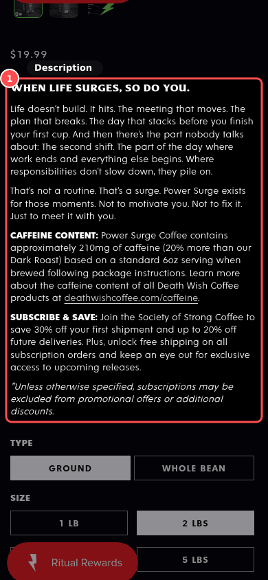
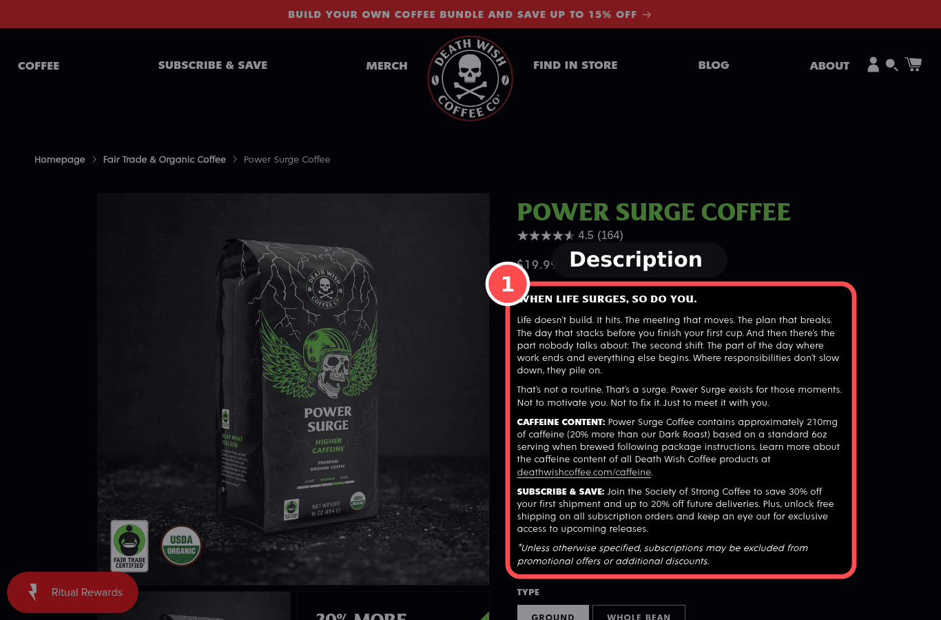
Description answers buying questions

Phone screenshot on deathwishcoffee.com/products/power-surge-coffee, marked to show: Description answers buying questions
Mobile, 390 × 844
deathwishcoffee.com/products/power-surge-coffee
Desktop screenshot on deathwishcoffee.com/products/power-surge-coffee, marked to show: Description answers buying questions
Desktop, 1366 × 900

01What we found

Description is about 184 words. Question coverage was not separately scored without a model call. Materials, fit, care, and dimensions were not scored without a model, so this stays a warning.

02Why it costs sales

Shoppers look for materials, fit, care and dimensions; scannable bullets answer them faster than prose.

The research: cognitive loadMain cause: clarity / anxietyFixes: motivation

03The fix. Who: Content/Ops

  1. 1Add short, scannable sections covering size/fit, materials, dimensions, care and what's in the box.

04What should change

Med impact on add-to-cart

If we rewrite descriptions as scannable bullets covering material, fit, size and care, then add-to-cart rate will rise, because common doubts are answered.

mobile 390, deathwishcoffee.com/products/power-surge-coffeenngroup.comcxl.com
Home

5 findings

03

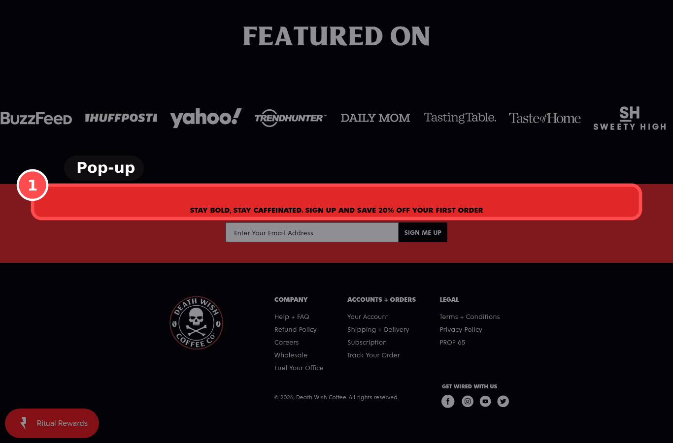
Fails, HighHomePXL 11/14Effort ~30mWho: AppJust do itHOM-07

Popup stack does not block the first visit

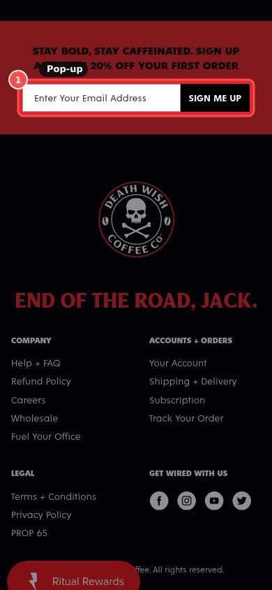
Phone screenshot on deathwishcoffee.com, marked to show: Popup stack does not block the first visit
Mobile, 390 × 844
deathwishcoffee.com
Desktop screenshot on deathwishcoffee.com, marked to show: Popup stack does not block the first visit
Desktop, 1366 × 900

01What we found

2 overlay(s) in the first seconds. More than one overlay is open.

02Why it costs sales

A popup on load interrupts the task before any value is seen; users close it reflexively and some leave.

The research: interruption cost, banner blindnessMain cause: distraction / anxietyFixes: ability

03The fix. Who: App

  1. 1Show at most one popup, delay it (e.g. after scroll or exit intent), and make sure it never covers the Add to cart button on mobile.

04What should change

High impact on returning-visitor CVR

59% of benchmarked sites use aggressive popups (Baymard UX statistics).

benchmark, not this store's forecast

If we delay the email popup until scroll/exit intent and keep only one overlay, then home and PDP bounce will fall and add-to-cart will rise, because the first visit isn't interrupted.

mobile 390, deathwishcoffee.combaymard.comnngroup.comdevelopers.google.com

08

Warning, HighHomePXL 9/14Effort ~1hWho: Content/OpsJust do itHOM-01

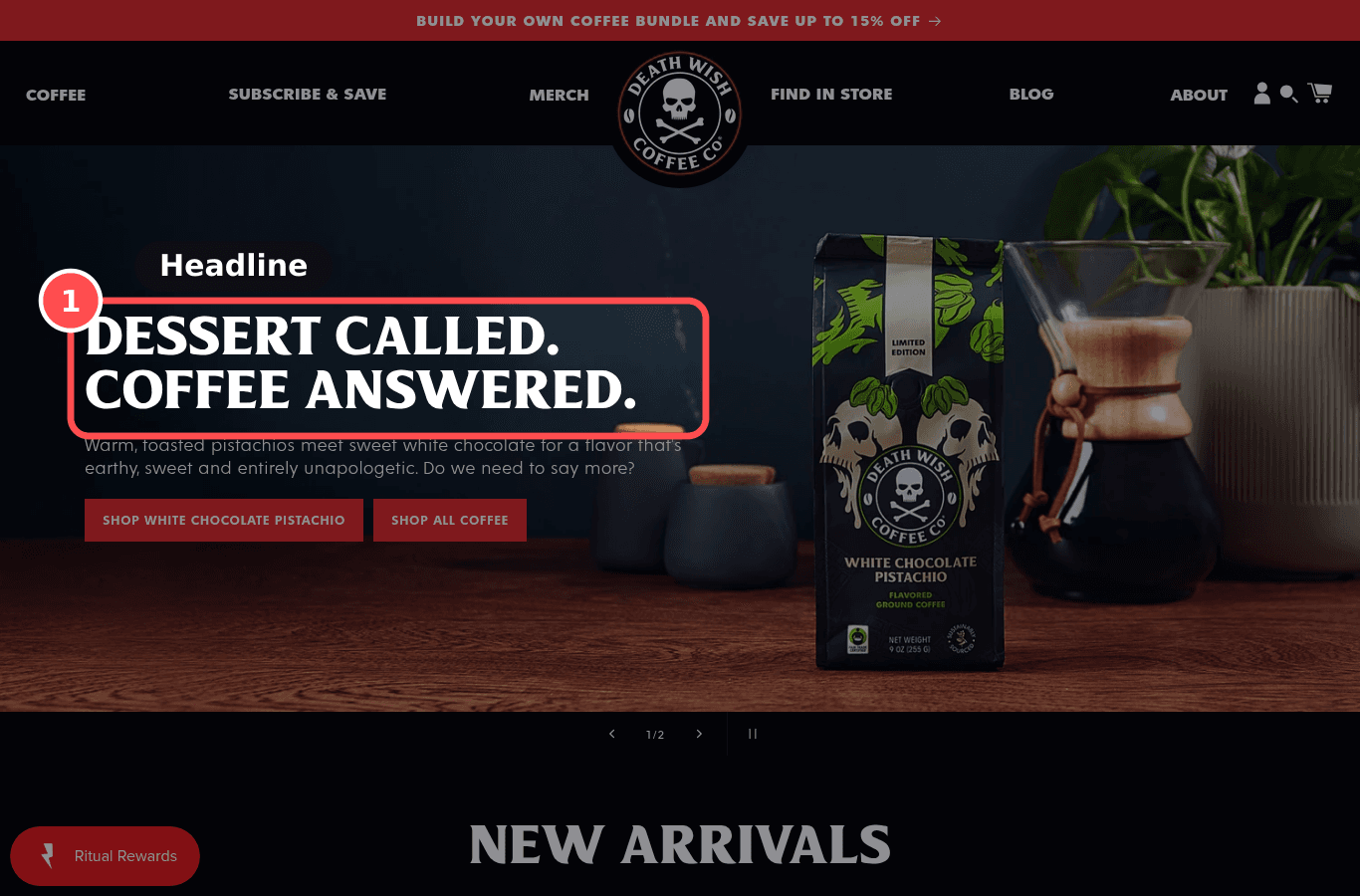
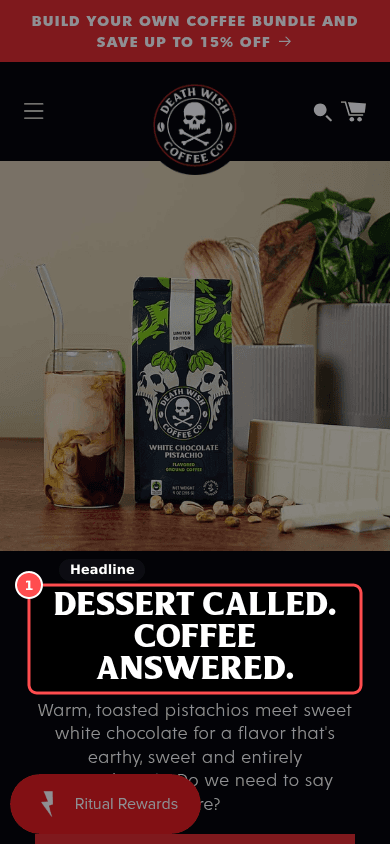
Value proposition is clear in 5 seconds

Phone screenshot on deathwishcoffee.com, marked to show: Value proposition is clear in 5 seconds
Mobile, 390 × 844
deathwishcoffee.com
Desktop screenshot on deathwishcoffee.com, marked to show: Value proposition is clear in 5 seconds
Desktop, 1366 × 900

01What we found

A headline is visible ("DESSERT CALLED. COFFEE ANSWERED.").

02Why it costs sales

Visitors decide within the first 10 to 20 seconds whether to stay; if the first screen doesn't say what is sold and why it's better here, the default is to leave.

The research: 5-second test, visual hierarchy, banner blindnessMain cause: value proposition / clarityFixes: motivation

03The fix. Who: Content/Ops

  1. 1Rewrite the hero headline as: what you sell + who it's for + the one reason to buy from you (e.g. 'Garment-dyed linen shirts, made to soften for years'). Keep it in live text, not baked into the image.

04What should change

High impact on returning-visitor CVR

If we replace the hero slogan with a concrete line (what we sell + for whom + main reason to buy here), then home→collection/PDP click-through will rise, because visitors can judge relevance before they lose interest.

mobile 390, deathwishcoffee.comcxl.comnngroup.comconversion.com

12

Warning, MedHomePXL 9/14Effort ~1hWho: Content/OpsJust do itHOM-04

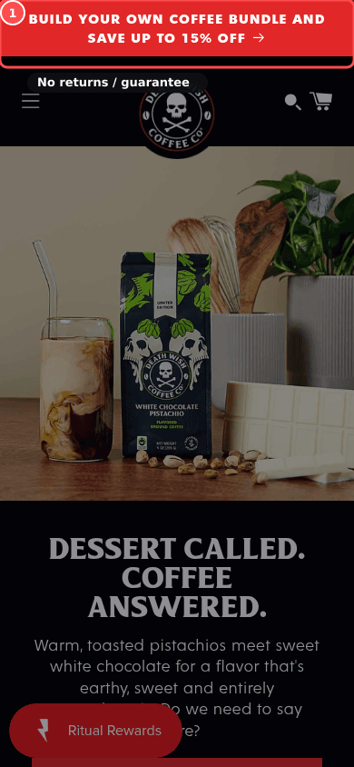
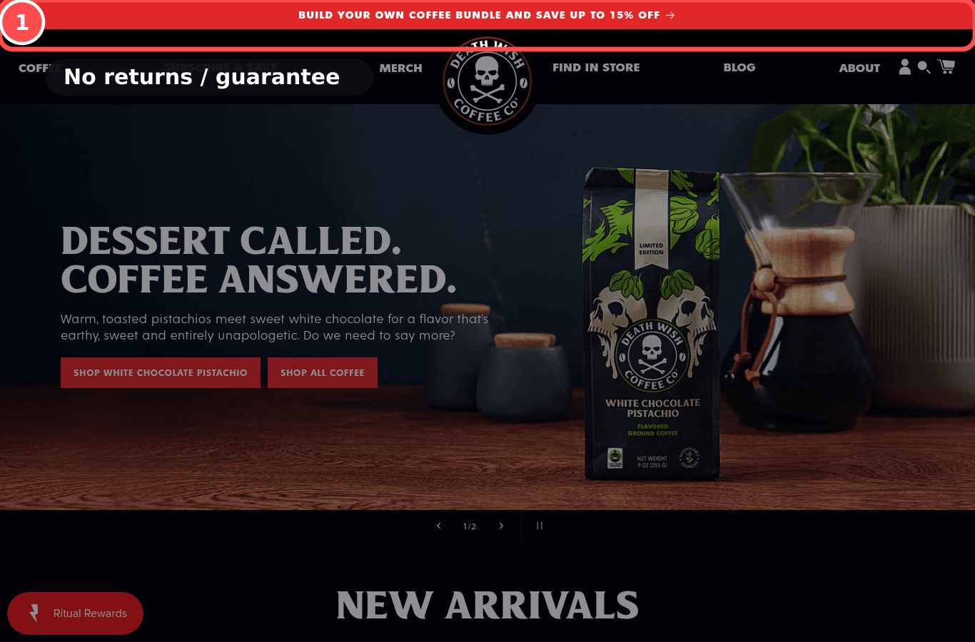
Shipping, returns and guarantee shown near the top

Phone screenshot on deathwishcoffee.com, marked to show: Risk-reducer bar (shipping, returns, guarantee) near the top
Mobile, 390 × 844
deathwishcoffee.com
Desktop screenshot on deathwishcoffee.com, marked to show: Risk-reducer bar (shipping, returns, guarantee) near the top
Desktop, 1366 × 900

01What we found

Only returns was found in the announcement, hero, or beside Add to cart.

02Why it costs sales

Unexpected costs and return worries are top abandonment reasons; stating them early reduces anxiety before the shopper invests effort.

The research: loss aversion, risk reversalMain cause: anxiety / value propositionFixes: motivation

03The fix. Who: Content/Ops

  1. 1Add a static row of 2 to 4 short reassurances (delivery threshold, returns window, dispatch time) under the header; don't rely on a rotating announcement bar.

04What should change

Med impact on returning-visitor CVR

Excluding 'just browsing', 40% of US shoppers who abandoned cited extra costs too high and 13% cited an unsatisfactory returns policy (Baymard abandonment survey).

benchmark, not this store's forecast

If we show a short USP bar ('Free delivery over $75 · 30-day returns · Ships in 2 days') under the header, then add-to-cart rate will rise, because shoppers' cost and risk questions are answered up front.

mobile 390, deathwishcoffee.combaymard.comnngroup.comeconometricsociety.org

18

Fails, LowHomePXL 8/14Effort ~30mWho: ThemeJust do itHOM-10

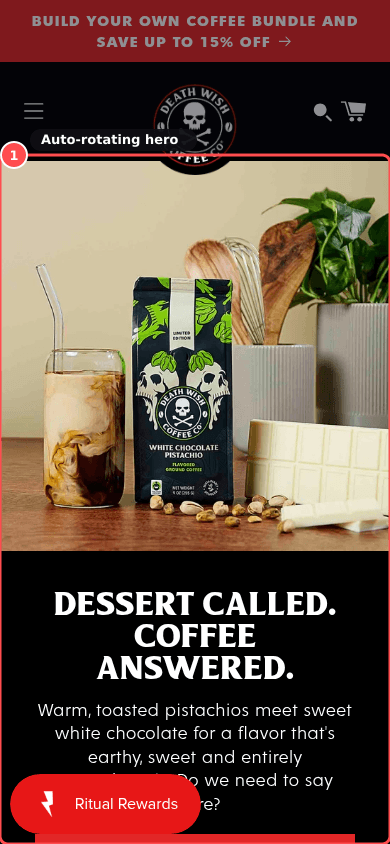
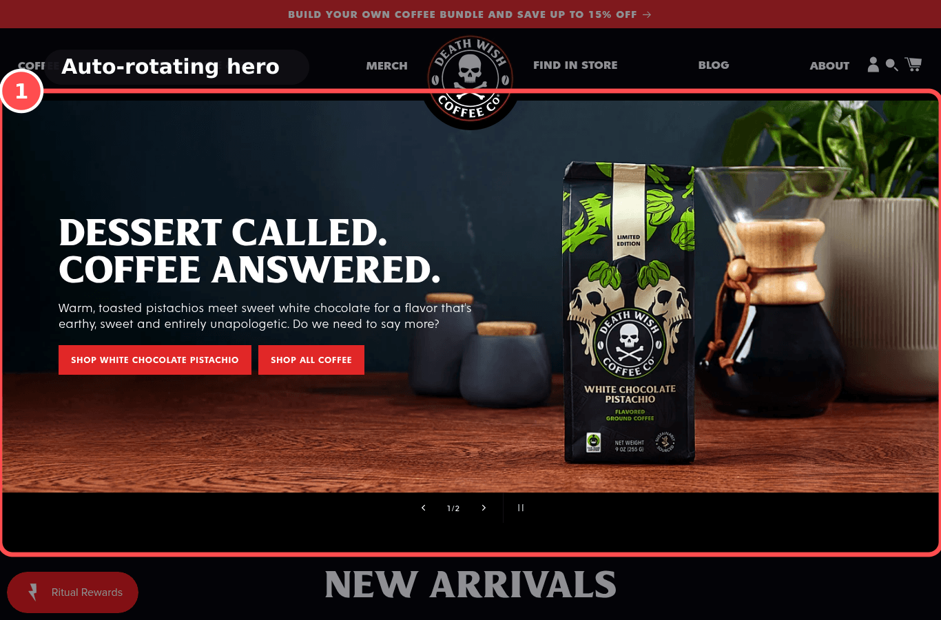
No hero carousel that rotates on its own

Phone screenshot on deathwishcoffee.com, marked to show: No auto-rotating hero carousel
Mobile, 390 × 844
deathwishcoffee.com
Desktop screenshot on deathwishcoffee.com, marked to show: No auto-rotating hero carousel
Desktop, 1366 × 900

01What we found

The hero slider is marked to autoplay.

02Why it costs sales

Auto-rotating slides move before people read them, hide most messages and take control from the user.

The research: banner blindness, user controlMain cause: clarity / distractionFixes: ability

03The fix. Who: Theme

  1. 1Turn off autoplay in the slideshow section settings, or replace the slideshow with a single image banner.

04What should change

Low impact on returning-visitor CVR

52% of benchmarked sites auto-rotate home carousels (Baymard, guideline #957).

benchmark, not this store's forecast

If we replace the auto-rotating hero with one static message, then hero CTA click-through will rise, because the main message stays readable.

mobile 390, deathwishcoffee.comnngroup.combaymard.com

22

Fails, MedHomePXL 7/14Effort ~1hWho: ThemeTestHOM-03

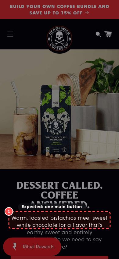
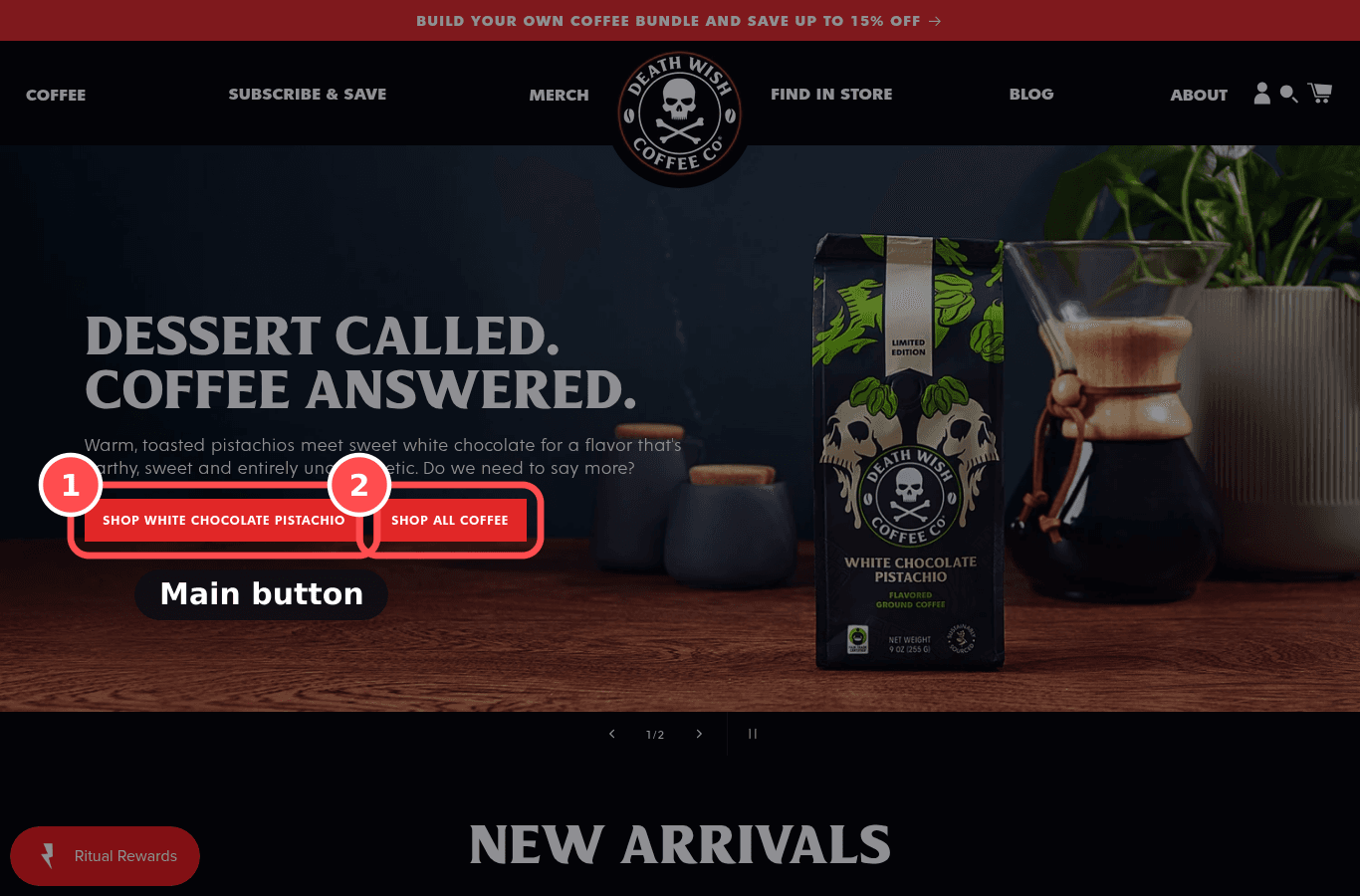
One dominant call to action on the first screen

Phone screenshot on deathwishcoffee.com, marked to show: One dominant call to action on the first screen
Mobile, 390 × 844
deathwishcoffee.com
Desktop screenshot on deathwishcoffee.com, marked to show: One dominant call to action on the first screen
Desktop, 1366 × 900

01What we found

No button-styled call to action was visible on the first screen.

02Why it costs sales

When several buttons compete with equal weight, the eye has no entry point; one visually dominant CTA works as Fogg's prompt.

The research: visual hierarchy, choice overloadMain cause: distraction / clarityFixes: prompt

03The fix. Who: Theme

  1. 1Keep one solid, high-contrast button in the hero ('Shop linen'); turn secondary actions into outline buttons or text links.

04What should change

Med impact on returning-visitor CVR

If we make one primary CTA visually dominant and demote the others to text links, then first-click rate on the home page will rise, because shoppers see the obvious next step.

mobile 390, deathwishcoffee.comnngroup.comconversion.combehaviormodel.org

Checkout

1 finding

07

Fails, MedCheckoutPXL 11/14Effort ~15mWho: Content/OpsJust do itCHK-03

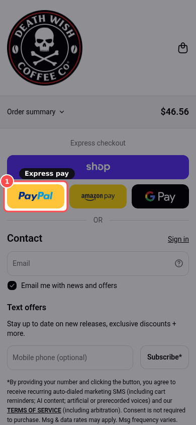
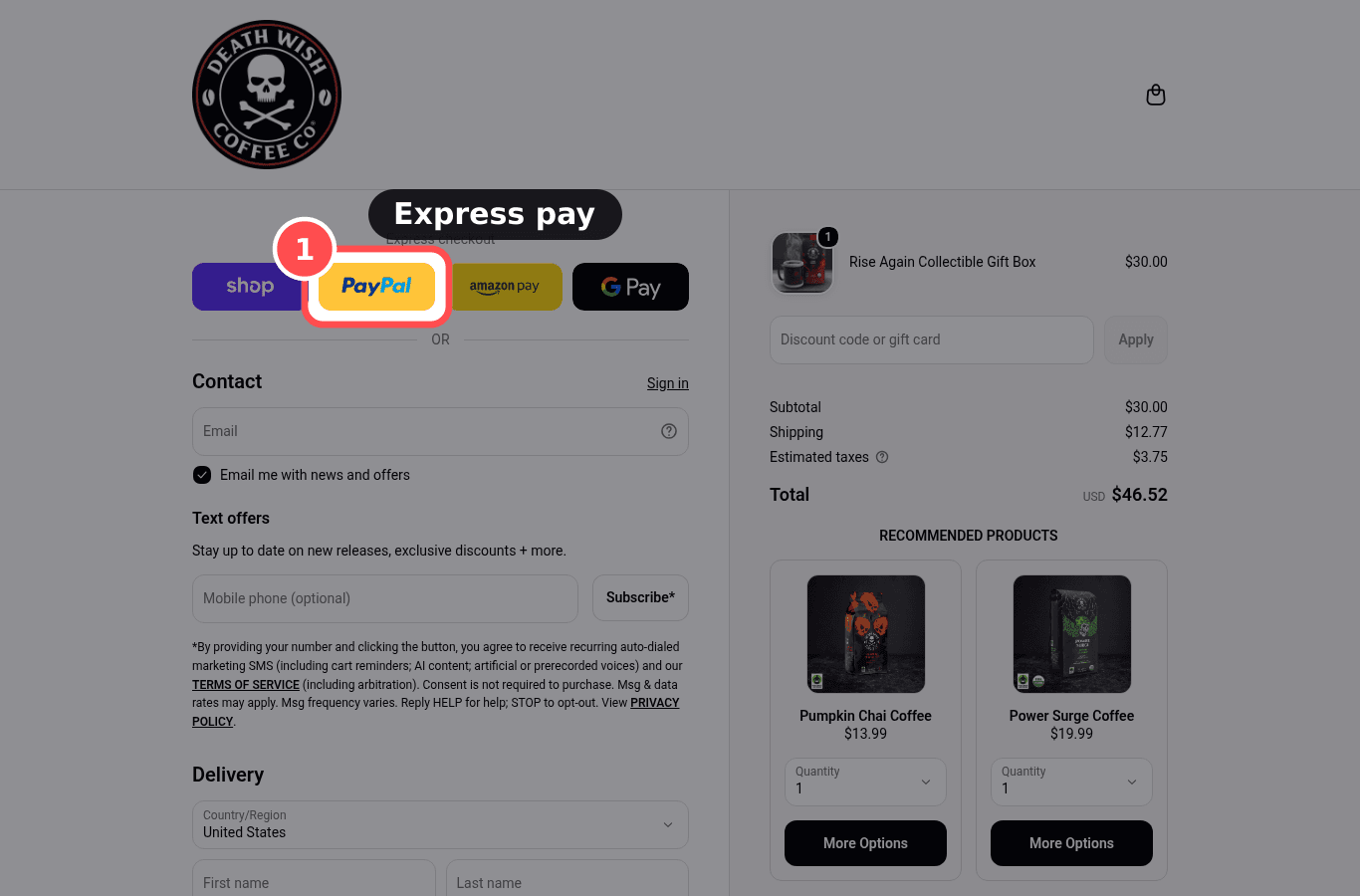
Express wallets shown first in checkout

Phone screenshot on deathwishcoffee.com/checkouts/cn/hWNHXe9NMIp2f2ObwoiGb8T4/en-us, marked to show: Express wallets shown first in checkout
Mobile, 390 × 844
deathwishcoffee.com/checkouts/cn/hWNHXe9NMIp2f2ObwoiGb8T4/en-us
Desktop screenshot on deathwishcoffee.com/checkouts/cn/hWNHXe9NMIp2f2ObwoiGb8T4/en-us, marked to show: Express wallets shown first in checkout
Desktop, 1366 × 900

01What we found

No express wallet was visible on the checkout landing.

02Why it costs sales

Shop Pay and other wallets at the top let returning users finish in a few taps.

The research: effort reductionMain cause: anxietyFixes: ability

03The fix. Who: Content/Ops

  1. 1Enable Shop Pay and other wallets in Settings → Payments so they show at the top of checkout.

04What should change

Med impact on checkout completion

If Shop Pay/Apple Pay/Google Pay are enabled and shown at the top, then checkout completion will rise, because wallet users skip forms.

mobile 390, deathwishcoffee.com/checkouts/cn/hWNHXe9NMIp2f2ObwoiGb8T4/en-usbaymard.comhelp.shopify.com

Trust

4 findings

11

Warning, MedTrustPXL 9/14Effort ~1hWho: App + Content/OpsTestTRU-07

Reviews and proof are believable and visible on every page

Phone screenshot on deathwishcoffee.com/products/rise-again-collectible-gift-box, marked to show: Social proof is credible and visible site-wide
Mobile, 390 × 844
deathwishcoffee.com/products/rise-again-collectible-gift-box
Desktop screenshot on deathwishcoffee.com/products/rise-again-collectible-gift-box, marked to show: Social proof is credible and visible site-wide
Desktop, 1366 × 900

01What we found

Reviews are on the product page. Home-wide ratings and whether testimonials are specific were not confirmed.

02Why it costs sales

Real ratings with counts and specific reviews persuade; perfect 5.0 scores or vague 'loved by thousands' claims look fake.

The research: social proof, credibilityMain cause: anxiety / value propositionFixes: motivation

03The fix. Who: App + Content/Ops

  1. 1Show your real average and review count on the home page and PDP; use specific customer quotes with first name and product.

04What should change

Med impact on returning-visitor CVR

Purchase likelihood peaked for average ratings of 4.0 to 4.7 and fell as ratings approached 5.0 (Spiegel Research Center).

benchmark, not this store's forecast

If we show real rating averages with counts on home and PDP (and stop hiding lower ratings), then add-to-cart rate will rise, because proof looks believable.

mobile 390, deathwishcoffee.com/products/rise-again-collectible-gift-boxspiegel.medill.northwestern.edunngroup.comcxl.com
13

Fails, HighTrustPXL 8/14Effort ~1hWho: Content/OpsJust do itTRU-01

Policies exist, are plain and linked near buy and footer

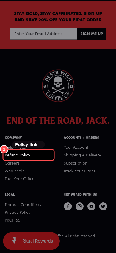
Phone screenshot on deathwishcoffee.com, marked to show: Policies exist, are plain and linked near buy and footer
Mobile, 390 × 844
deathwishcoffee.com
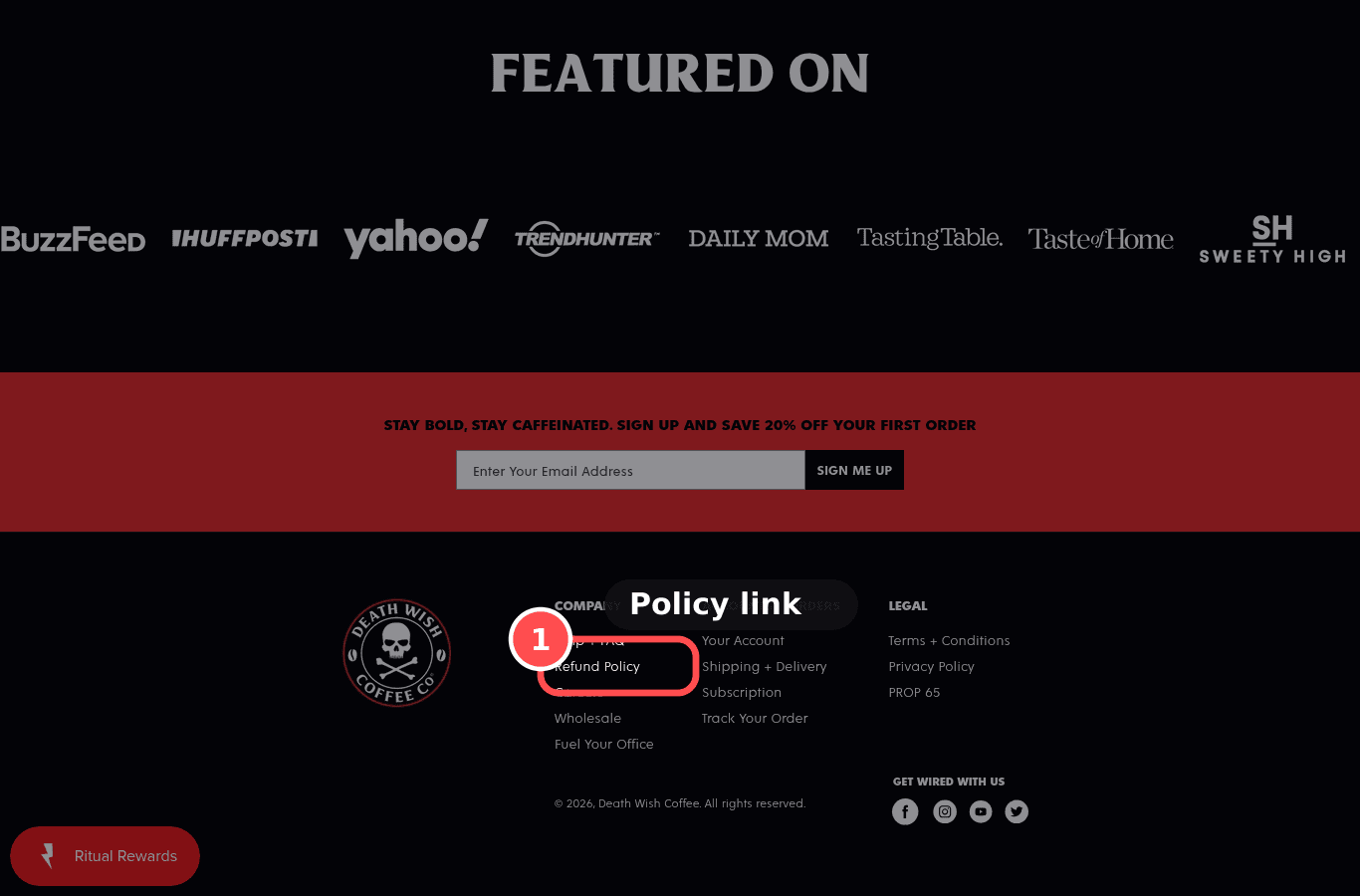
Desktop screenshot on deathwishcoffee.com, marked to show: Policies exist, are plain and linked near buy and footer
Desktop, 1366 × 900

01What we found

Refund policy exists, shipping policy exists, footer links no, product-page mention no.

02Why it costs sales

Clear, readable returns and shipping policies reduce purchase risk; legal-only wording increases doubt.

The research: risk reversalMain cause: anxietyFixes: motivation

03The fix. Who: Content/Ops

  1. 1Publish refund and shipping policies (Settings → Policies) and link them in the footer and next to the buy button.

04What should change

High impact on returning-visitor CVR

13% of US abandoners cited an unsatisfactory returns policy (Baymard abandonment survey).

benchmark, not this store's forecast

If policies are linked near the buy box and footer and summarised in plain language, then add-to-cart rate will rise, because risk feels lower.

mobile 390, deathwishcoffee.combaymard.comnngroup.com
15

Fails, MedTrustPXL 8/14Effort ~30mWho: Content/OpsJust do itTRU-02

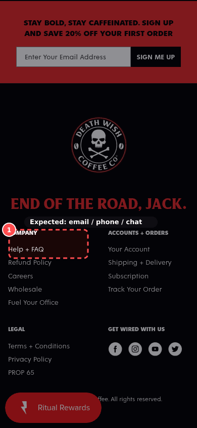
Real contact options

Phone screenshot on deathwishcoffee.com, marked to show: Real contact options
Mobile, 390 × 844
deathwishcoffee.com
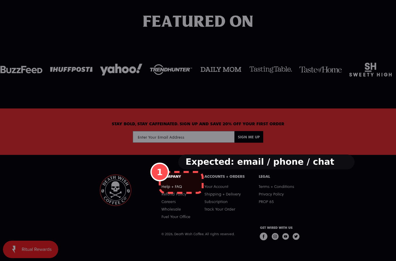
Desktop screenshot on deathwishcoffee.com, marked to show: Real contact options
Desktop, 1366 × 900

01What we found

No email, phone, chat, or contact-page link was found in the footer.

02Why it costs sales

A real email, address or phone shows a business that will answer; their absence is a scam signal.
The research: trustworthy designMain cause: anxietyFixes: motivation

03The fix. Who: Content/Ops

  1. 1Show a real email and/or phone and a contact page link in the footer.

04What should change

Med impact on returning-visitor CVR

If contact details are easy to find, then returning-visitor CVR will rise, because the store looks accountable.

mobile 390, deathwishcoffee.comnngroup.com

27

Warning, LowTrustPXL 6/14Effort ~2hWho: Content/OpsJust do itTRU-08

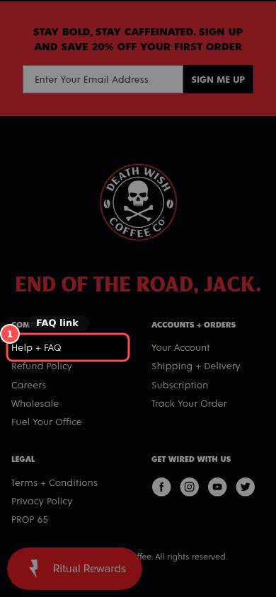
FAQ / help answers are easy to reach

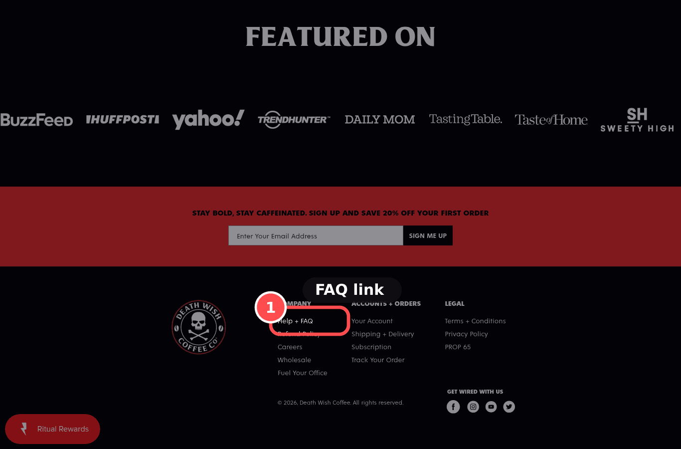
Phone screenshot on deathwishcoffee.com, marked to show: FAQ / help answers are easy to reach
Mobile, 390 × 844
deathwishcoffee.com
Desktop screenshot on deathwishcoffee.com, marked to show: FAQ / help answers are easy to reach
Desktop, 1366 × 900

01What we found

A help link exists (Help + FAQ). Whether it covers shipping, returns, and fit was not fetched.

02Why it costs sales

Shoppers with a last question (sizing, delivery, returns) leave if the answer isn't findable in a tap or two.

The research: self-service, recognition over recallMain cause: anxietyFixes: ability

03The fix. Who: Content/Ops

  1. 1Create an FAQ page (delivery, returns, sizing, payment) and link it in the footer and as a collapsible block on the PDP.

04What should change

Low impact on returning-visitor CVR

If an FAQ covering delivery, returns and sizing is linked from the PDP and footer, then add-to-cart rate will rise, because last doubts get answered without leaving.

mobile 390, deathwishcoffee.combaymard.comnngroup.com

Speed

4 findings

21

Fails, MedSpeedPXL 7/14Effort ~2hWho: DevJust do itSPD-04

No layout shift near buy elements (CLS)

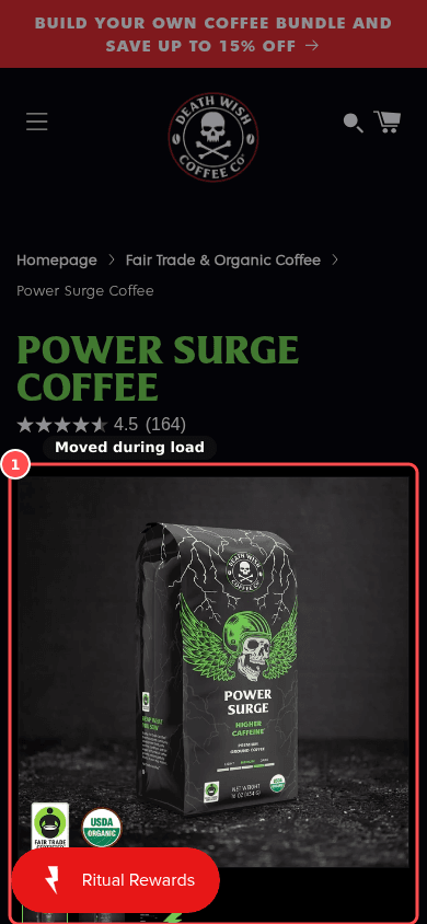
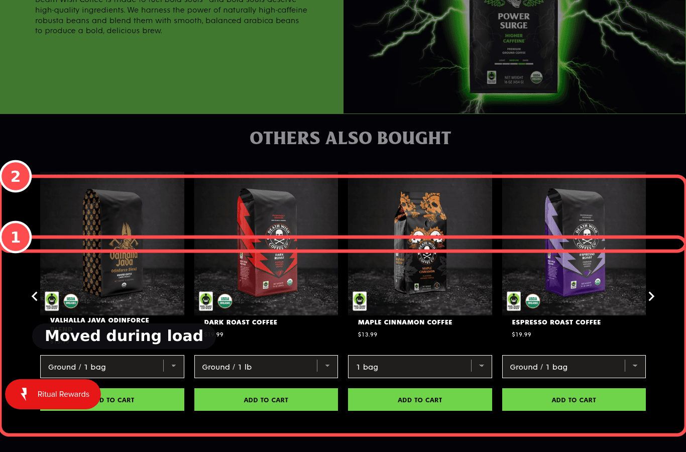
Phone screenshot on deathwishcoffee.com/products/power-surge-coffee, marked to show: No layout shift near buy elements (CLS)
Mobile, 390 × 844
deathwishcoffee.com/products/power-surge-coffee
Desktop screenshot on deathwishcoffee.com/products/power-surge-coffee, marked to show: No layout shift near buy elements (CLS)
Desktop, 1366 × 900

01What we found

CLS 0.827 via the audit browser (lab, not field data).

02Why it costs sales

Content jumping under the thumb causes taps on the wrong button.

The research: error preventionMain cause: anxietyFixes: ability

03The fix. Who: Dev

  1. 1Reserve space for images, review stars and banners so the buy button doesn't jump while the page loads.

04What should change

Med impact on returning-visitor CVR

Good CLS ≤0.1, poor >0.25 at p75 (web.dev).

benchmark, not this store's forecast

If CLS stays ≤0.1 around the buy box, then mis-taps will fall and add-to-cart will rise, because buttons stay where the thumb expects.

mobile 390, deathwishcoffee.com/products/power-surge-coffeeweb.devnngroup.com

24

Fails, HighSpeedPXL 6/14Effort ~1 dayWho: DevInvestigateSPD-03

Interaction responsiveness (INP)

Phone screenshot on deathwishcoffee.com/products/rise-again-collectible-gift-box, marked to show: Interaction responsiveness (INP)
Mobile, 390 × 844
deathwishcoffee.com/products/rise-again-collectible-gift-box
Desktop screenshot on deathwishcoffee.com/products/rise-again-collectible-gift-box, marked to show: Interaction responsiveness (INP)
Desktop, 1366 × 900

01What we found

total blocking time 1545ms via the audit browser (lab, not field data).

02Why it costs sales

Taps that respond late feel broken; shoppers tap again or give up.

The research: visibility of system statusMain cause: anxietyFixes: ability

03The fix. Who: Dev

  1. 1Remove or defer apps and scripts that run on every page so taps on Add to cart and options respond instantly.

04What should change

High impact on returning-visitor CVR

Good INP ≤200ms, poor >500ms at p75 (web.dev).

benchmark, not this store's forecast

If INP drops to ≤200ms on the PDP, then ATC errors will fall, because taps feel instant.

mobile 390, deathwishcoffee.com/products/rise-again-collectible-gift-boxweb.devnngroup.com

25

Fails, MedSpeedPXL 6/14Effort ~2hWho: AppInvestigateSPD-05

App scripts aren't slowing the page

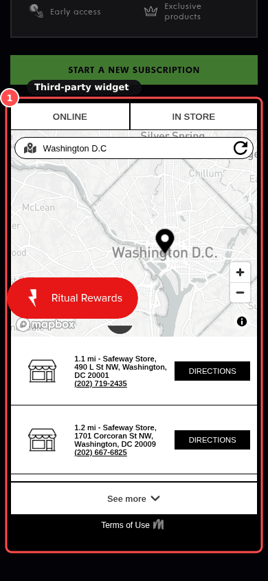
Phone screenshot on deathwishcoffee.com/products/power-surge-coffee, marked to show: Third-party app scripts are under control
Mobile, 390 × 844
deathwishcoffee.com/products/power-surge-coffee
Desktop screenshot on deathwishcoffee.com/products/power-surge-coffee, marked to show: Third-party app scripts are under control
Desktop, 1366 × 900

01What we found

38 third-party script origins, about 289KB.

02Why it costs sales

Every app embed adds script weight; leftover apps slow every page for no benefit.

The research: performance budgetMain cause: anxietyFixes: ability

03The fix. Who: App

  1. 1Audit installed apps: uninstall unused ones, turn off their app embeds, and keep only what earns its place.

04What should change

Med impact on returning-visitor CVR

If we remove unused app embeds, then LCP/INP will improve and bounce will fall, because pages carry less script.

mobile 390, deathwishcoffee.com/products/power-surge-coffeeweb.dev

26

Warning, MedSpeedPXL 6/14Effort ~1 dayWho: DevInvestigateSPD-07

Cart drawer and filters respond quickly

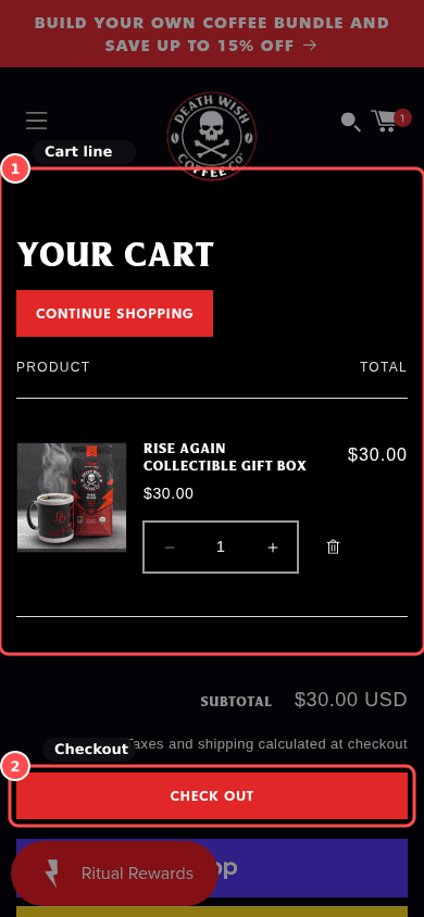
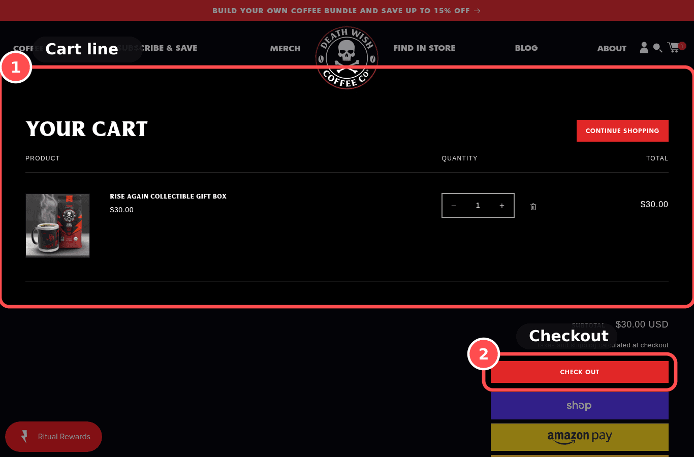
Phone screenshot on deathwishcoffee.com/cart, marked to show: Cart drawer and filters respond quickly
Mobile, 390 × 844
deathwishcoffee.com/cart
Desktop screenshot on deathwishcoffee.com/cart, marked to show: Cart drawer and filters respond quickly
Desktop, 1366 × 900

01What we found

cart feedback 793ms. filter update not measured.

02Why it costs sales

Waits over about a second after tapping Add to cart or a filter break the shopper's flow.

The research: response-time limitsMain cause: anxietyFixes: ability

03The fix. Who: Dev

  1. 1Simplify the cart drawer (fewer upsell widgets) so it opens instantly after Add to cart.

04What should change

Med impact on returning-visitor CVR

If cart drawer and filter updates complete in under 1s, then cart reach and filter use will rise, because interactions feel immediate.

mobile 390, deathwishcoffee.com/cartnngroup.comweb.dev

Collection

1 finding

23

Warning, LowCollectionPXL 7/14Effort ~1hWho: ThemeJust do itCOL-06

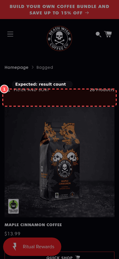
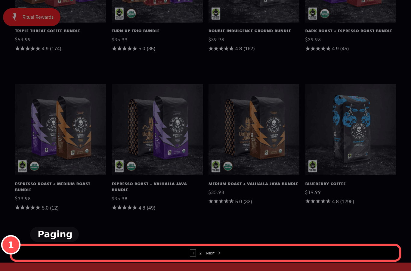
Result count and paging are clear

Phone screenshot on deathwishcoffee.com/collections/bagged, marked to show: Result count and paging are clear
Mobile, 390 × 844
deathwishcoffee.com/collections/bagged
Desktop screenshot on deathwishcoffee.com/collections/bagged, marked to show: Result count and paging are clear
Desktop, 1366 × 900

01What we found

A result count is shown, without a paging control.

02Why it costs sales

Showing how many items there are and using 'Load more' instead of tiny page links helps shoppers judge the effort and keep browsing.

The research: choice overload, user controlMain cause: clarityFixes: ability

03The fix. Who: Theme

  1. 1Show 'X products' above the grid and replace numbered pagination with a 'Load more' button (often a theme setting).

04What should change

Low impact on returning-visitor CVR

If we show the product count and a 'Load more' button, then products viewed per session will rise, because browsing feels finite and controllable.

mobile 390, deathwishcoffee.com/collections/baggedbaymard.comnngroup.com

05. Your 90 day plan

What to do, in what order.

06. How we tested

What we saw, and what we couldn't.

Pages walked

  • Homedeathwishcoffee.com3901366
  • Collectiondeathwishcoffee.com/collections/bagged3901366
  • Product (with variants)deathwishcoffee.com/products/power-surge-coffee3901366
  • Product (simple)deathwishcoffee.com/products/rise-again-collectible-gif…3901366
  • Cartdeathwishcoffee.com/cart3901366
  • Checkout landingdeathwishcoffee.com/checkouts/cn/hWNHXe9NMIp2f2ObwoiGb8…3901366

Limits of this scan

  • Public pages only. The scanner may add an item to its own cart; it never fills checkout or places an order.
  • Couldn't see: COL-08 (Back button keeps scroll position). Checks we couldn't see are left out of the score.
  • Research numbers are labelled as benchmarks, not as a forecast for this store. We don't promise a percentage increase.
  • Scored from public pages only. A guide, not a forecast. Check each finding against your own analytics.