04
Warning, MedProductPXL 11/14Effort ~2hWho: Theme/AppTestPDP-03
Add to cart stands out, and the buy box is clean
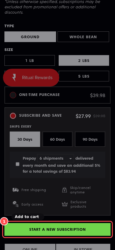
deathwishcoffee.com/products/power-surge-coffee
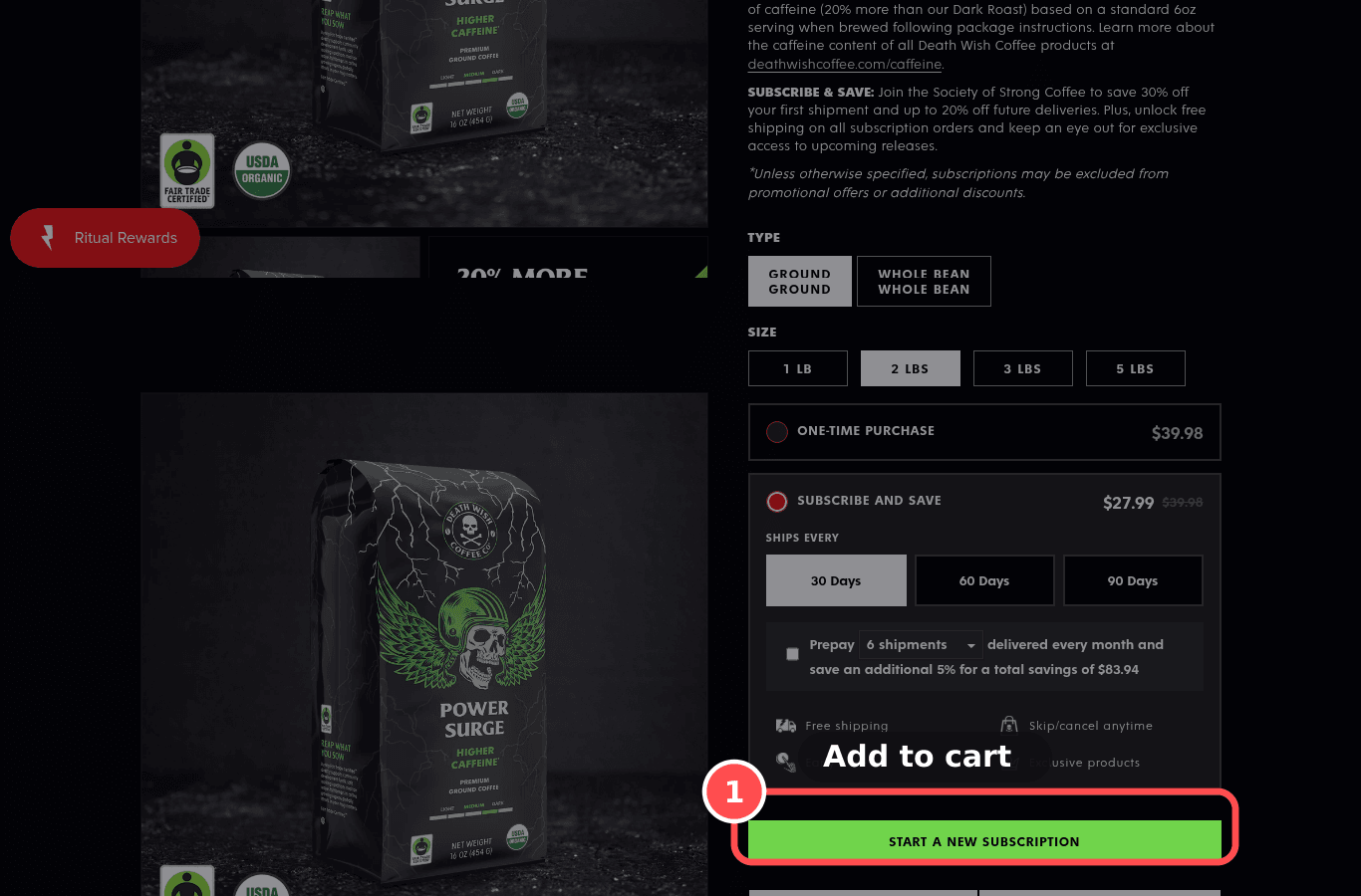
01What we found
Buy box: 12 blocks between price and Add to cart. Dominant button: yes.
02Why it costs sales
Badges, app widgets and secondary buttons in the buy box compete with the one action that matters.
The research: visual hierarchy, choice overloadMain cause: distraction / clarityFixes: prompt
03The fix. Who: Theme/App
- 1Give Add to cart a full-width solid style in the brand accent; move badges, upsells and extra app widgets below the button.
04What should change
Med impact on add-to-cart
If we make ATC the largest, highest-contrast element and move non-essential widgets below it, then add-to-cart rate will rise, because the primary action stands out.
mobile 390, deathwishcoffee.com/products/power-surge-coffeenngroup.comconversion.combaymard.com